Do, re, mi
The three syllables DO, RE, MI are stacked in three rows. These are the first three sounds of the name and the sound with which the music begins. If you place three lines on the staff, the company name becomes the melody.


DOREMI ENTERTAINMENT · SINCE 2006The turquoise trapezoid in the logo is
light from a projector
16 DRAMAS · 18 OSTWith that light, we illuminated 16 dramas
and created 18 OSTs
WEBSITE RENEWAL Now on the homepage
It's time to turn on the lights
DOREMI ENTERTAINMENT · WEBSITE RENEWAL PROPOSAL
DOREMI ENTERTAINMENT Homepage Renewal Proposal
SCENE & SCORE · STORIES THAT STAY Two Directions
DOREMI ENTERTAINMENT is a production company that has been producing dramas starting with SBS’s “Please Come Back, Soon-ae” in 2006. So far, I have personally produced 16 dramas and created 18 drama OSTs. I am also in charge of actor management and work marketing.
BlueCanvas proposed two directions for redesigning the company's website. SCENE & SCORE, which opens the scene with the light and music of a projector, and STORIES THAT STAY, which captures the lingering feeling of the story with movie-like images and deep teal and amber colors. This page summarizes the considerations and process that led to the two design proposals.
FOUR QUESTIONS
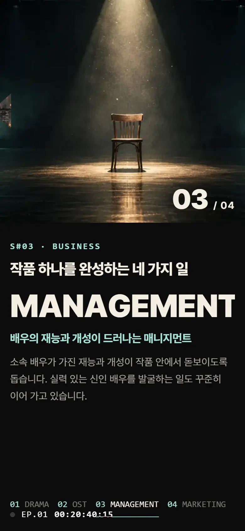
We decided to show four scenes one by one on the main screen: drama, OST, management, and marketing.
For each work, the role of whether it was a drama production or an OST was written down, and a separate scene was given for the OST.
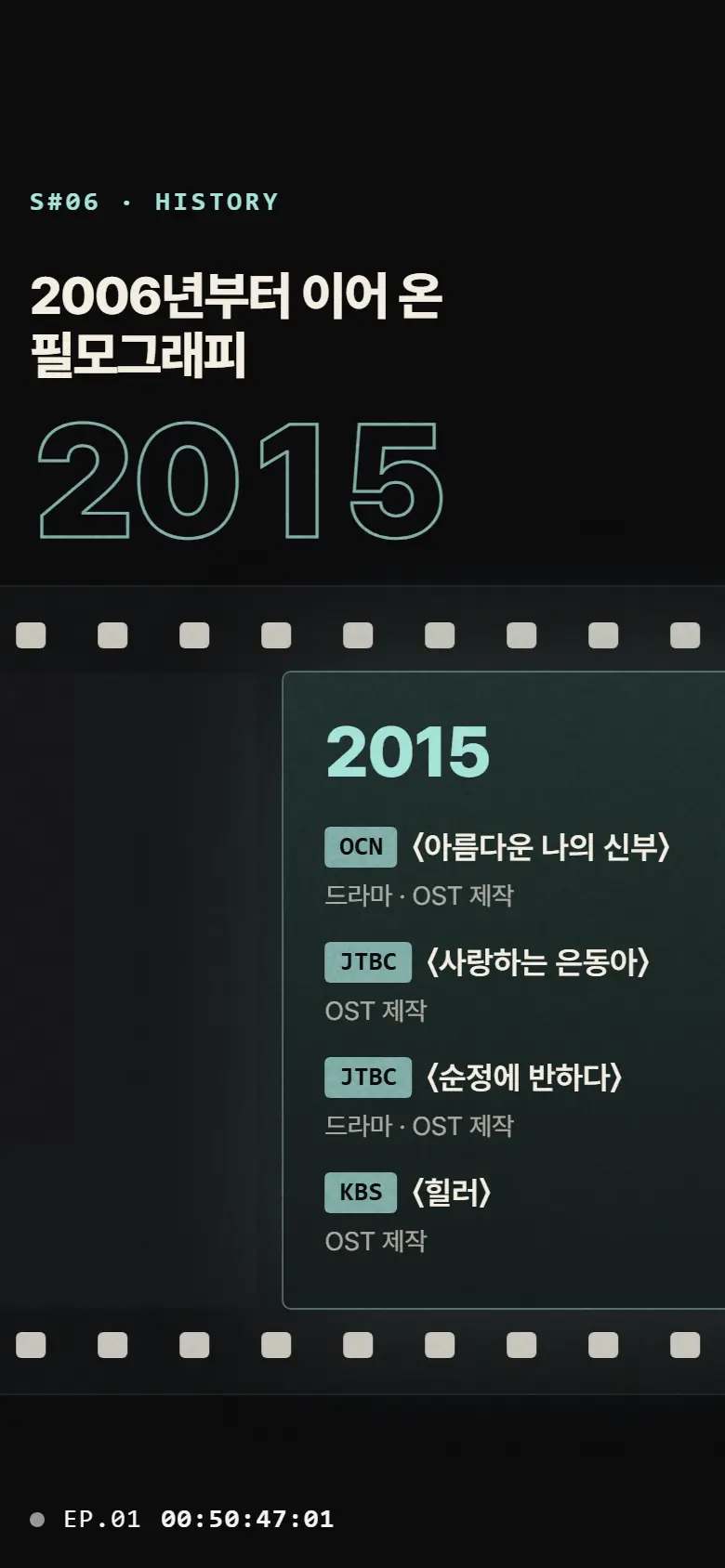
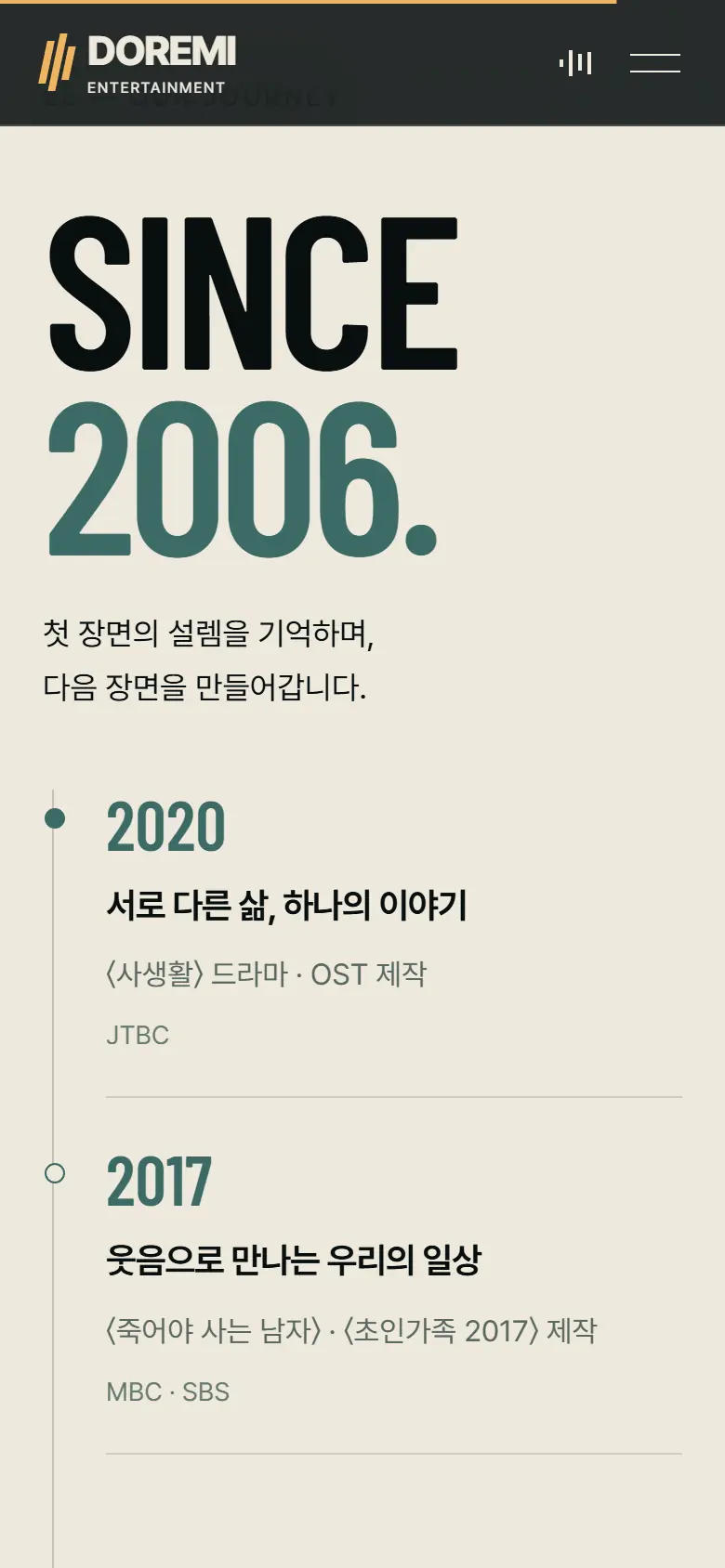
The works by year were organized on a film strip for Proposal A, and in a history list for Proposal B.
Scenes that flow horizontally were changed to be swiped with a finger, and the font size and scene length were adjusted to fit the vertical screen.
We re-read the current logo before creating a new emblem. The three-syllable name, the turquoise trapezoid, and the two-color logo tell the story of the entire website.
The three syllables DO, RE, MI are stacked in three rows. These are the first three sounds of the name and the sound with which the music begins. If you place three lines on the staff, the company name becomes the melody.
The turquoise trapezoid in front of RE comes from the company symbol. In the symbol, this shape is placed next to two film reels, forming the shape of a projector. The trapezoid is the light extending from the projector to the screen, and in the logo, RE stands in place of the projector instead of reel.
The light represents the scene on the screen, and the name of the scene represents the music that flows in that scene. The two things that Doremi does, drama and OST, are included in the name and symbol. The names of the first design, SCENE & SCORE, came from this interpretation.
There are only two colors used in the logo: #231F20, which is almost black, and #81ADA8, which is cyan. The palette in both designs started with this turquoise color.
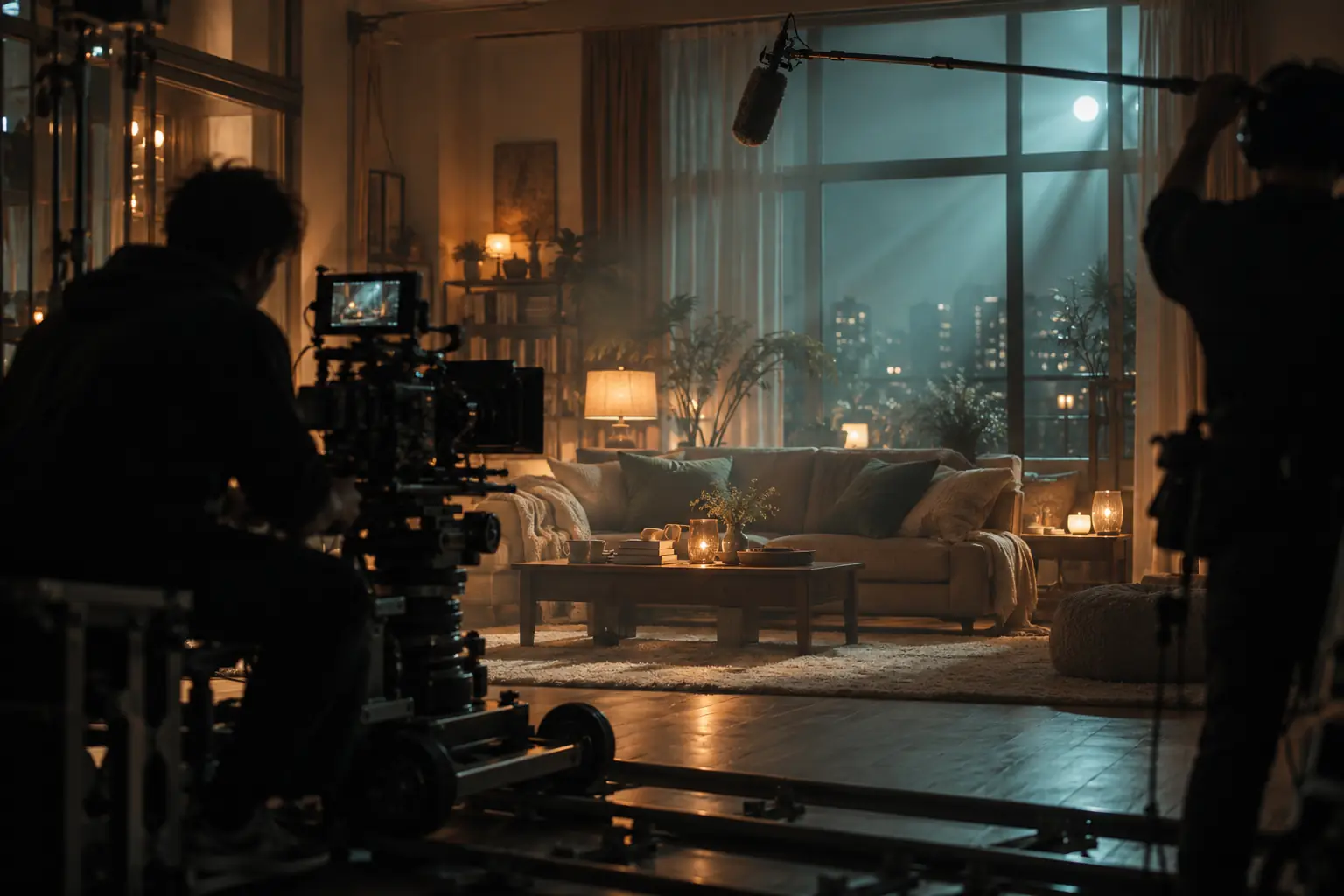
The words that came out of the brand interpretation were light, scene, score, stage, city, and film. I created an image of a scene that matches each word and used it as material for both designs. This is to convey the atmosphere of the drama production company even without photos of the actors.



Not only viewers but also people who work with the production company often visit the website. Since each person visiting had different information they wanted to check, we first decided which scene each person would arrive at.
Check which work was created and with which channel.
S#04 WORKS · S#06 HISTORYLooking for management methods and audition news.
S#07 NEW FACELet’s take a look at what drama OSTs were made for.
S#05 OSTFind work news, press releases, and wallpapers.
S#08 PR ROOMThe structure of four menus was divided into nine scenes. I started designing after writing down the location, time, and content for each scene like a scene list in a script. Below is the scene list of Proposal A SCENE & SCORE.
The light of the projector turns on, the light becomes a staff, and the three notes do, re, and mi sound. SCENE & SCORE appears with the logo.
The story from the first work in 2006 to the present is summarized in four numbers, followed by an introduction to the company.
It shows the drama, OST, management, and marketing scene by scene.
The 16 self-made dramas flow horizontally like a film.
We introduce OST 18 between the notes and waveforms on the staff.
Works from 2006 to 2020 are placed on the filmstrip.
This leads to news of an audition looking for the next main character in an empty chair under the lights.
Organize press releases, announcements, wallpapers, and brand films into four cards.
The site ends with company information and filmography posted like ending credits.
Based on the logo's turquoise #81ADA8, I found the color by varying the brightness and temperature. If you turn it towards the light, it becomes mint in A, and if you turn it towards the film, it becomes deep till in B. Inside B, the amber color of tungsten lighting, which is the opposite of the turquoise color, was added to create the warmth of a theater.
#81ADA8Trapezoid in logo#A6E3D9Teal illuminated by projector light · Proposal A#3F6F69Accent color on a bright background · Proposal A#0C292ARecords and inquiries Base of the scene · Proposal B#EFB563Warm light of theater lighting · BBackground · 60%This is the color of the projection room with the lights off. Most of the background is painted in this color so that the light and text can be seen most clearly.
Screen · 26%This is the color of the screen that the light hits. Like the company introduction and OST, it is written on the background of a bright scene and on the text of a dark scene.
Light of the logo · 7%The turquoise color is taken directly from the trapezoid of the logo. I only use it for logos and small accents.
Light on · 4%This is a color that turns cyan towards the light. Write small marks in the dark, such as timecode and scene numbers.
Light of the shade · 3%This is a color that lowers turquoise toward the shade. Write scene numbers and highlight letters on a light background.
Chestnut · 46%It is black with a blue undertone. It is the foundation on which videos and photos are placed.
Film Base · 22%This is a color that reduces cyan to the depth of the film base. Records and inquiries write on the wide side of the scene.
Paper · 22%This is the basis for the gallery and history of the work. It reminded me of the paper in a theater program book.
Lighting · 7%This is the color of tungsten lighting, the opposite of cyan. Place only one word in the title and the button.
Lingering · 3%Color of auxiliary sentences and captions. I set the brightness to be readable even on a dark background.
Clicking on a color swatch will copy the HEX value. The numbers in the sample are the contrast in brightness with the color of the text above them.
The English title of Proposal A was written in Archivo, which allows the character width to be changed from 62 to 125. If you widen the width as shown in the sample below, it will feel like the 4:3 screen is unfolding in cinemascope. Timecode and scene numbers were set to JetBrains Mono, and Korean was set to Pretendard. For Proposal B, I chose Barlow Condensed, which is narrow and tall, just like the title on the movie poster.
wdth 62SCENE & SCORE
EP / HH:MM:SS:FFEP.01 00:00:00:00
S#01 THE BEAM · S#02 ABOUT · S#03 BUSINESS
600STORIES
THAT STAY.
400 · 600 · 800Even when the scene ends
the music remains.
Music is what makes you remember the emotions of a drama for the longest time.
Both designs treat scrolling like a video playhead. Lowering it moves the scene forward, raising it rewinds it. Because visitors set the pace, even long stories won't get boring.
The projector light in the first scene of Proposal A draws 180 frames according to the scroll position. As you pass this card, the frames are passed in the same way.
The timecode and scene number at the bottom of the screen tells you which scene you are currently watching. The table of contents bar below this page moves in the same way.
In the business introduction scene in Proposal A, the photo opens with the light form of a projector. As a new scene appears, the trapezoid widens to fill the screen.
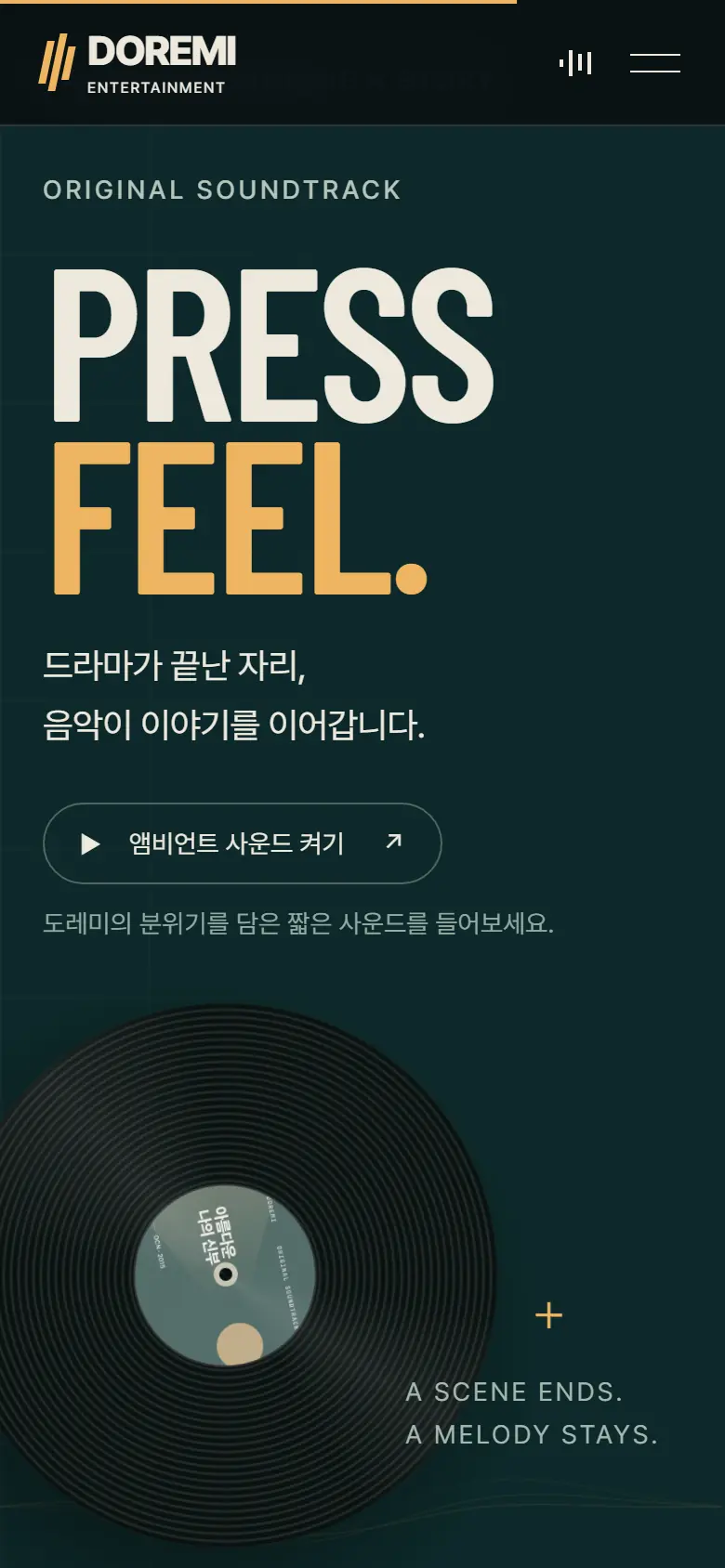
In the record scene in B, you must press the button for the ambient sound to play. Sound only comes out when the visitor turns it on.
This is the direction to introduce the company using the light of the projector and the staff paper. On the first screen, the light becomes a staff, the three notes do, re, and mi light up, and then the logo appears. Nine scenes follow the time code at the bottom of the screen like a drama.
Among the scenes in Proposal A, I chose a moment that I put a lot of effort into directing. Click on the photo to see a larger view of each scene.
The beam of light from the projector turns into a staff, and on it the three notes do, re, and mi light up in order.
As the film rolls like a tunnel, the numbers 16 dramas and 18 OSTs come to mind.
The large letters on the left and the scene on the right change together to introduce four business areas one by one.
When you scroll down, the 16 self-made dramas pass horizontally like films in a movie theater.
Musical notes flow on bright paper, followed by a list of 18 OST pieces with waveforms below.
As the year changes, a large number moves along, showing works from 2006 onwards.
An audition guide looking for new actors is placed on an empty, illuminated chair.
At the end of the site, the credits roll like a movie and the filmography is shown again.
This direction captures the lingering feeling of the work with movie-like images and deep teal and amber colors. When you scroll down, a 10-second brand video plays at that speed, followed by a night scene of Seoul, a horizontal art gallery, and a spinning record.
Among the scenes in Proposal B, I chose a moment that I put a lot of effort into directing. Click on the photo to see a larger view of each scene.
A large title is placed on the light-filled film. If you scroll down, the video will play forward.
Write down the power of stories that the company believes in in one sentence, and reveal each word at your reading speed.
The night scene of Seoul, which was visible through a small window, expands to fill the screen as you scroll.
The poster flows horizontally, and when you press the card, the work details window opens.
Drama, music, management, and marketing are spread out in large-letter accordions.
Pressing the button next to the spinning record will play a short ambient sound.
The history goes from top to bottom, starting in 2020 and going back to the first work.
The final scene asks what next story we will create together.
We created a brand film for each design proposal so that it could be used on the website's website and introductory materials. The A film is accompanied by a short piece of music tailored to the scene, and the B film is played according to the scrolling speed on the first screen.
This is a video in which the light from a projector becomes a staff line, and the three notes do, re, and mi lead to a scene in the film, and end with a logo.
This is a video in which the camera moves slowly over a light-filled film and the lighting changes. It plays repeatedly without sound.
Many people first check audition notices or project news on their cell phones. The gallery of works that flowed horizontally can be flipped with a finger, and the length and font size of fixed scenes have been adjusted to fit the vertical screen.
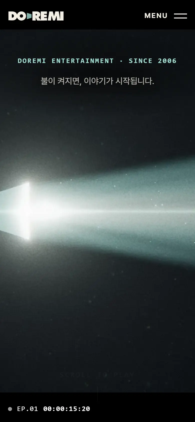
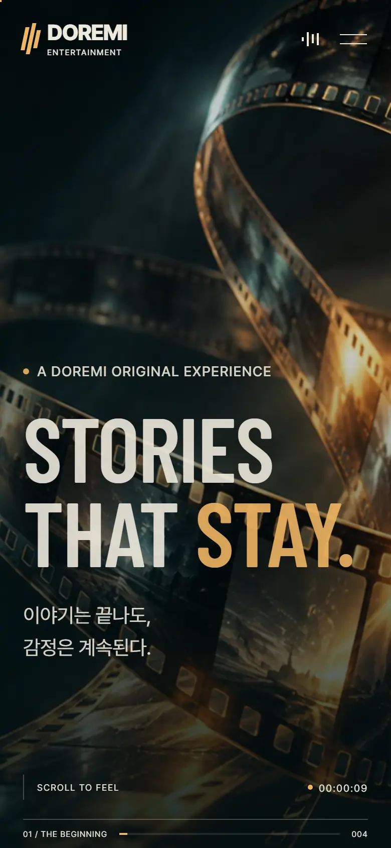


The two designs contain the same content, but the way they open the scene and the atmosphere are different. We've organized the differences so you can choose based on what your company wants to say first on the home screen.
WEBSITE RENEWAL PROPOSAL
FILMOGRAPHY · 2006–2020
TO BE CONTINUED
The website is where people who work with you first meet your company.
Let’s read again, starting with the company’s name and symbol.
 Education · School
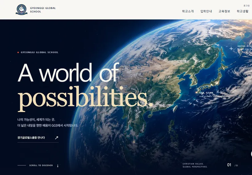
Gyeonggi Global School
A main-page renewal proposal for a Christian alternative school. Faith and the world are tied into one story, “From one point to the world,” with navy, gold and ultramarine colors, two proposals, LUMEN (light) and HORIZON, and scroll motion graphics.
 Media · Publishing
Munhakdongne Publishing Group
A website renewal proposal for a publishing group. The brand reading starts from “dongne,” the word for neighborhood in its name. It includes colors from paper, ink and bookmark ribbon, four proposals, and experiences for browsing books and reading serials.
 Global enterprise
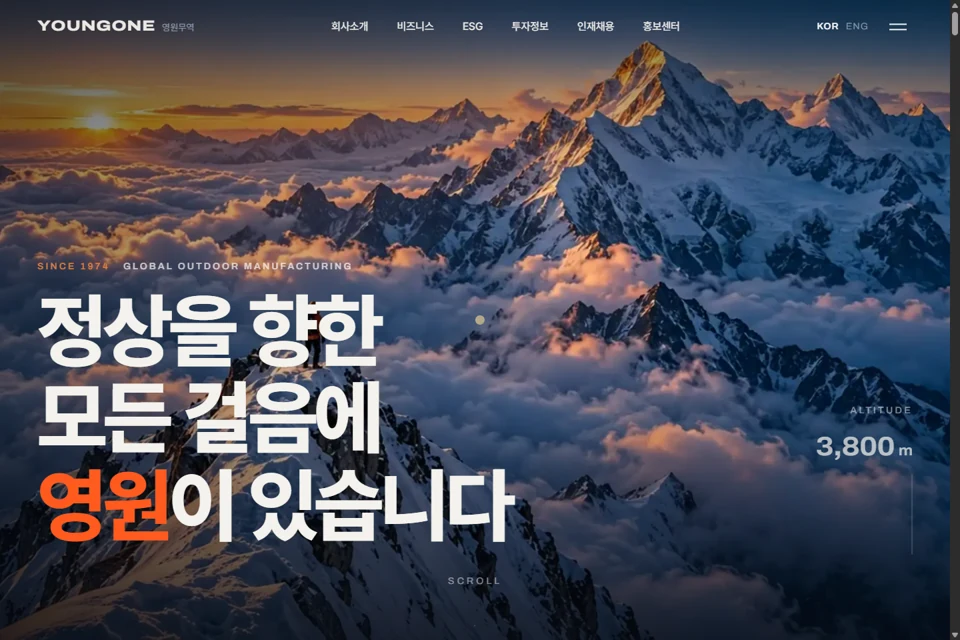
Youngone Corporation
A website renewal proposal for a global OEM company whose name never appears on the label. It includes the brand reading “From the inside of clothing to the outside of the world,” a color system, a main-page proposal that begins on a snowy mountain, scroll interactions for the manufacturing process, and screens for the global network, materials and ESG.
Contact
Tell us where you are and what you want to achieve. We’ll outline a practical scope, process, and estimated budget.
DIRECT
Your inquiry has been received. We will reply within one business day with a scope and an estimate.