Request a project consultation Skip to project introduction
BLUECANVAS SELECTED WORKPURME FOUNDATION · NON-PROFIT
A forest made up of blue circle trees of different sizes and lime green sprouts

PURME FOUNDATION · WEBSITE RENEWAL PROPOSAL

A typical day
a forest where growing

Purme Foundation homepage renewal proposal
Brand interpretation, information structure, UI design, accessibility

Start the story
01 / OVERVIEWProject Overview

From a website asking for donations, to
A Forest Growing Together.

Purme Foundation is a non-profit foundation that has been helping people with disabilities achieve rehabilitation and independence since 2005. As the number of places managed by the foundation has increased, including children's rehabilitation hospitals, developmental rehabilitation centers, welfare centers, and social farms, the stories that the website has to tell have also increased.

While BlueCanvas was creating and operating the Purme Foundation website, we thought about the direction of renewal and what the next website should look like. This page is a record of the proposal and process.

Purme Foundation homepage in operation
CLIENT
Purme Foundation
Purme Foundation
SECTOR
Nonprofit foundation
Rehabilitation and independence of the disabled
OUR ROLE
Research, information architecture, brand experience,
UI design, accessibility, motion prototyping
DELIVERABLE
4 types of renewal design proposals, design system, sponsorship flow, campaign template
  • #nonprofit foundation
  • #Sponsorship Experience
  • #web accessibility
  • #Information Structure
  • #Brand Experience
  • #Easy writing
  • #Campaign Template
  • #Design System
  • #Responsive

It started from the numbers the foundation had built up.

2005

The year the foundation was founded with permission from the Ministry of Health and Welfare.

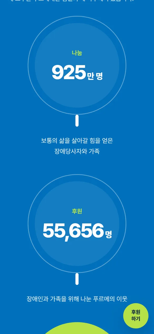
9250,000 people

Persons with disabilities and their families who gained the strength to live a normal life

55,656

Sponsors who share for the disabled and their families

8consecutive years

Korea Guide Star public interest corporation evaluation
Highest grade

Number source: Purme Foundation website public data

02 / THE QUESTION

people Purme Foundation On the website what to do Shall we come? first Sponsorship determined person, the receipt necessary long time sponsor, and To the child fit support looking for family there is. same first on the screen count person each of their own the road as soon as find number Must be I did it.

ANALYSISThree things discovered on the current homepage
01

The business expanded, but the stories were scattered.

Six institutions and four business areas, including hospitals, centers, welfare centers, social farms, sports centers, and libraries, were being introduced in their own languages. It was difficult for a first-time visitor to say in one sentence what this foundation does.

Tying into one story from a tree to a forest
02

There were several doors to support.

There were many entrances, including regular and one-time donations, different pages for each campaign, corporate social contribution, small donations, and anniversary donations. First-time sponsors may be confused about where to start.

One entrance, three choices
03

A language of respect was needed rather than sympathy.

The foundation's mission is to lead social change so that people with disabilities can enjoy normal lives. Although the screen depicting a sad story could move one's heart, it was far from the ordinary life that the foundation describes.

Not as a pitiful protagonist, but as a person living each day.

I first drew the
three people standing on the first screen.

Instead of dividing visitors by age or gender, we divided them by reason for coming to the website. Because if the reasons are different, what you should look at first is also different.

first time comer
Can this foundation be trusted?
  • A glance at what the foundation does
  • Transparent management and numbers
  • Start your sponsorship without any burden

In Design Find the sponsorship that’s right for you

long-time supporter
Where did my support reach?
  • Where donations are spent
  • My sponsorship details and receipt
  • What's new from the foundation

In the design, My donation details/receipt

family seeking support
Is there any support my child can receive?
  • Assistance you can apply now
  • How to apply written in simple language
  • Check selection results

In the design, Distribution notification and application information

03 / BRAND THINKING

The answer was already
withinthe symbol.

“It symbolizes a young sprout growing into a strong tree and forming a green forest.”Purme Foundation CI Introduction
  1. 01 · Sprout · Rehabilitationtime to take the first step

    Every day spent in the treatment room grows sprouts.

  2. 02 · Tree · Self-reliancepower to stand on one's own

    You spend your day doing your part at work and learning.

  3. 03 · Forest · TogetherOrdinary life living together

    A neighborhood where the barrier between disabled and non-disabled people is lowered becomes a forest.

BRAND STATEMENT

Instead of asking for help, say
Let’s grow together.

From the mission “So that disabled people can enjoy a normal life”To the proposed sentence “A forest where a normal day grows”
01 / RESPECT

People come first.

Call “child” before “disabled child.” Disability is just one of many facts that describe a person.

02 / CONCRETE

Tell us what will change.

Instead of vague hope, it shows in detail how support can change things, like continuing treatment or going to work every day.

03 / TOGETHER

The subject is “we.”

There is no division into those who help and those who are helped. We also call our sponsors neighbors who grow the forest together.

PHOTOGRAPHY DIRECTION

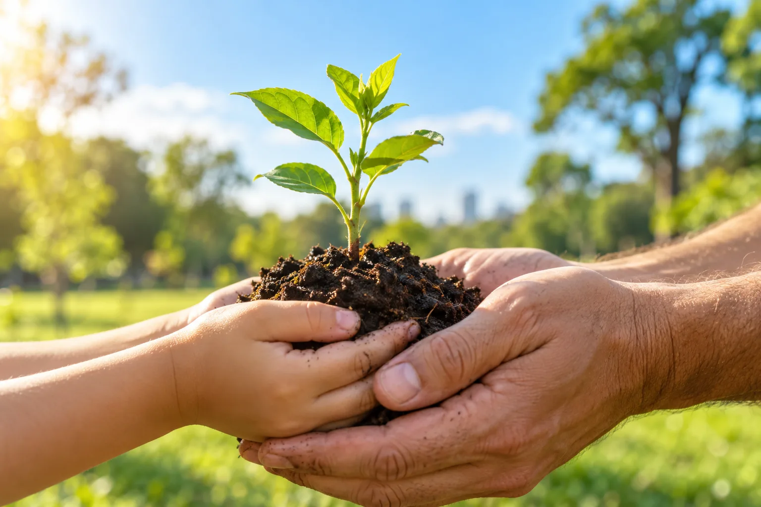
I take pictures of hands and steps rather than faces,
daily life rather than directing.

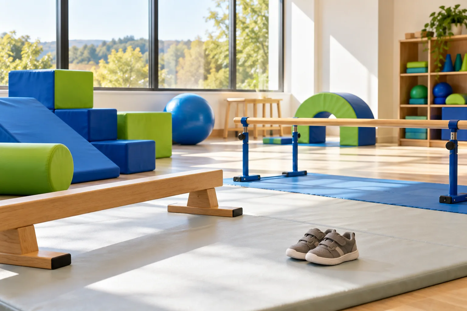
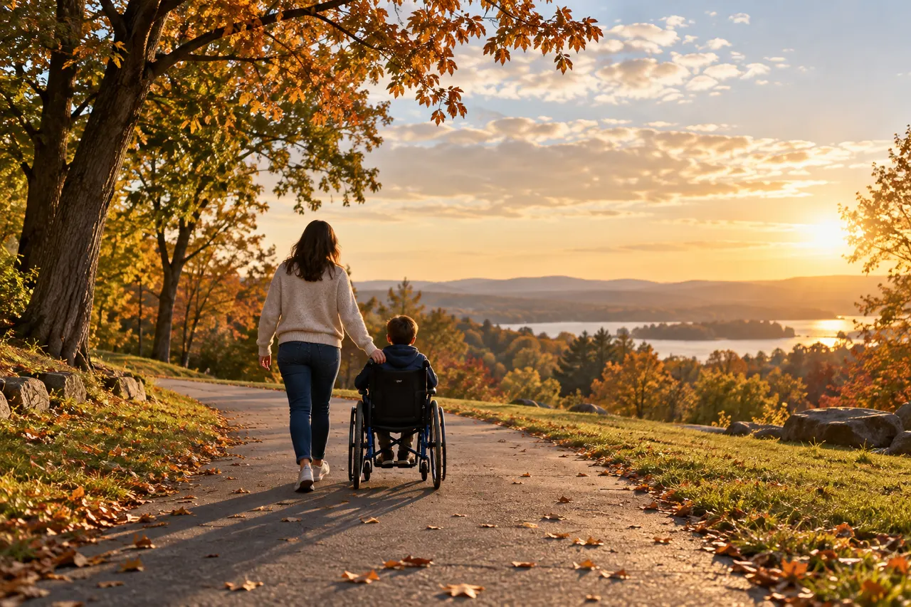
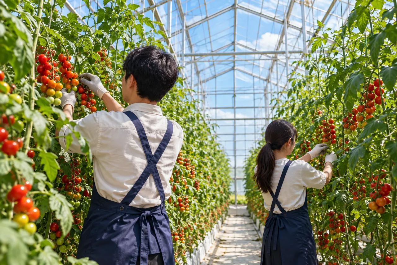
The website photo first shows the foundation's attitude. Instead of putting the faces of the child and family first, we set the standard for telling the story through hands, steps, and a day in the sunlight.

A child's and an adult's hands wrapping a sprout and soil together
01 · Heart conveyed through hands
A sunny rehabilitation room and small sneakers
02 · A place where people stay
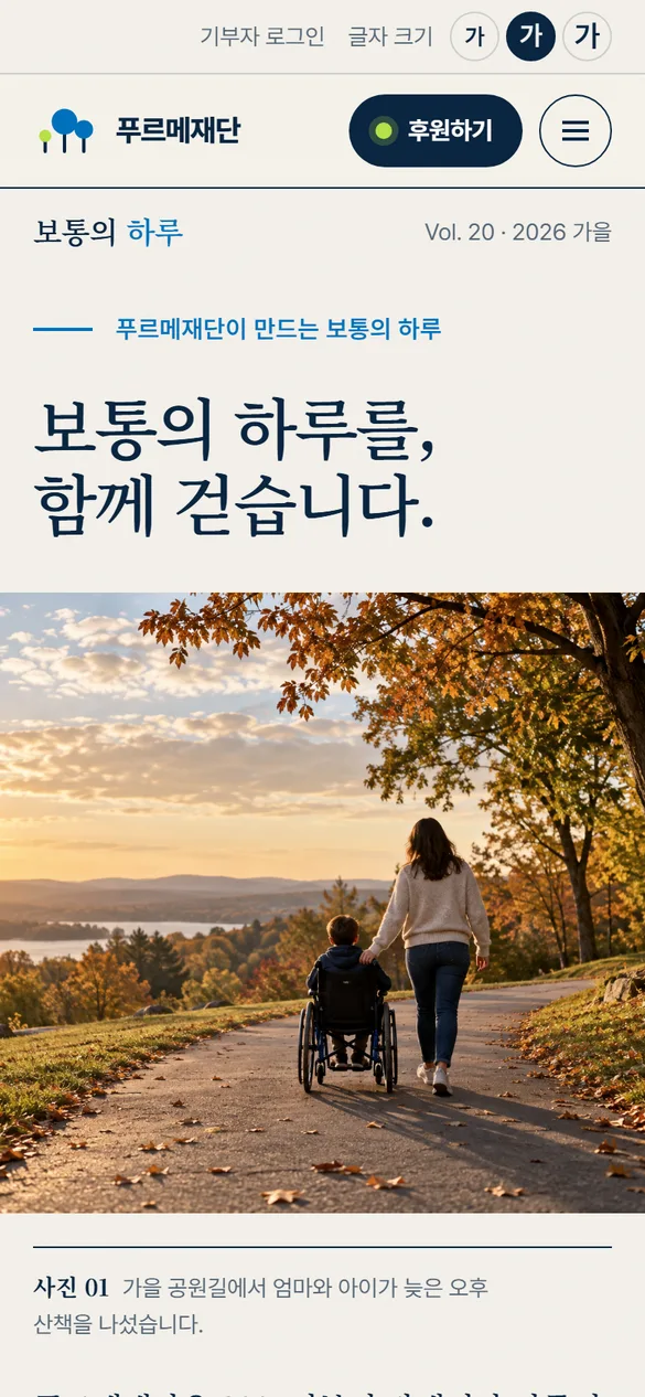
The back view of a mother and a child in a wheelchair walking together on an autumn park road
03 · Companionship seen from behind
  • DOHands, steps, back view, work done
  • DONatural light and everyday places
  • DON'TTears, dark lighting, sympathetic composition
  • DON'TClose-up of child's face without consent
Back view of two young men tending tomato stems in a glass greenhouse
04 · People who do their own work
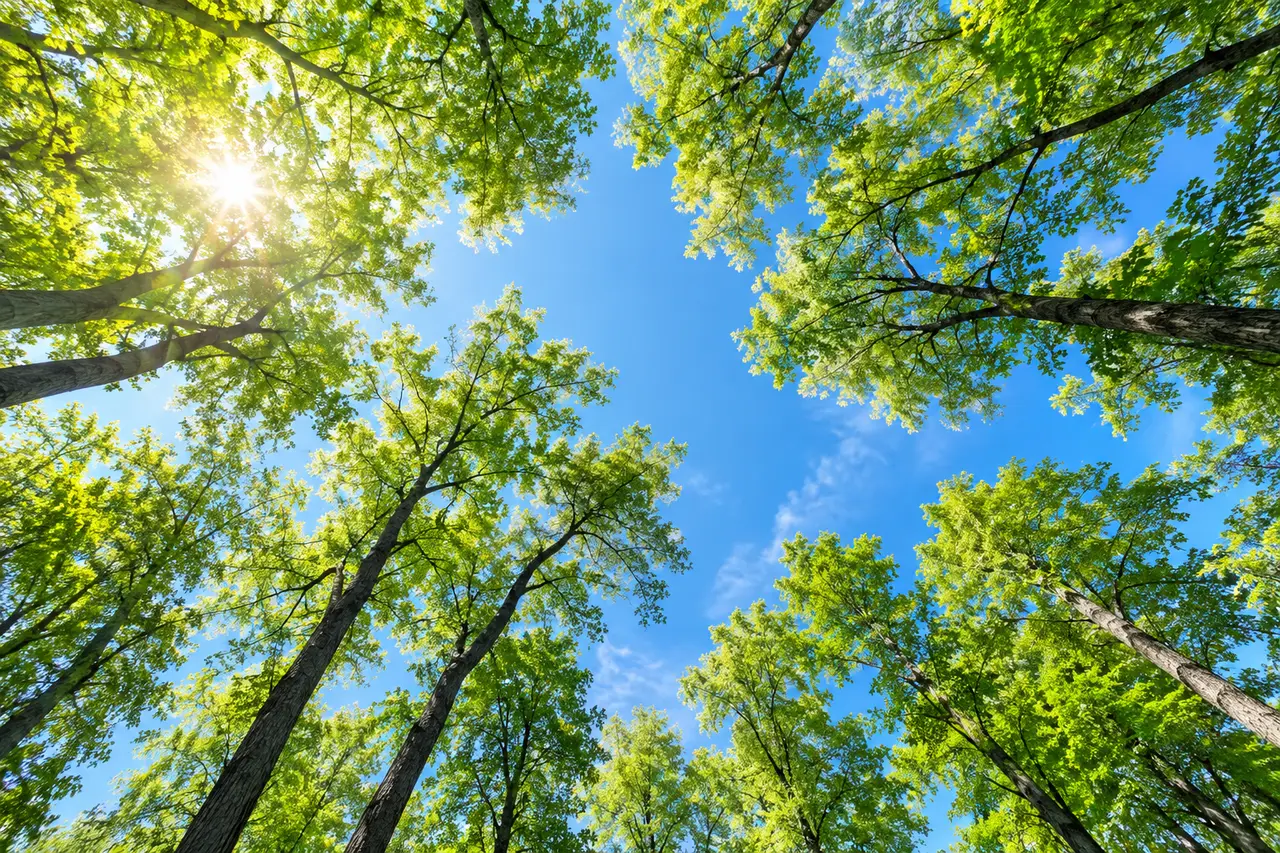
Blue sky seen between tall trees
05 · Forest light
Blue, navy, light blue, lime and yellow paper samples and small bud pots
04 / COLOR SYSTEM

CI's blue is the same, with the lime of the sprout added.

Purme Foundation's blue symbolizes health and hope. Instead of changing the blue, I added a color to the bud to mark the moment it grows.

COLOR EXPLORATIONI thought about three palettes
OPTION 1 · FOREST GREEN

The name “Blue Mountain” reminded me of green.

Purme means green mountain, so the green forest looked natural. However, when it collided with CI's blue, the impression of an environmental group was stronger.

hold
OPTION 2 · WARM CHARITY

I tried to move my heart with warm orange.

It is a warm color often used in sponsorship campaigns. However, there was an atmosphere of urgent need for help, and the temperature was different from what the foundation says is a typical day.

hold
OPTION 3 · BLUE & SPROUT

I planted a sprout on the blue.

With CI blue at the center, we created an easy-to-read background using navy. Lime was only used in places that encouraged participation, making it stand out like a sprout on the screen. It also flows naturally with the rhyme used in the Purme Run graphic.

adopted
Purme Blue#0071BCRGB 0 113 188

health and hope

CI blue is used for symbols, major buttons, and links. I inherited it without changing it.

white letters
5.1:1 AA
Navy letters
3.0:1 Large letters
Ink Navy#0A2540RGB 10 37 64

reading background

Background for body text and dark scenes. It connects with blue more softly than black.

white letters
15.5:1 AAA
Navy letters
1.0:1 Disabled
Sprout Lime#B5E048RGB 181 224 72

sprout signal

I only write in places where participation is encouraged. Text is always posted in navy.

white letters
1.5:1 Not used
Navy letters
10.2:1 AAA
Sky Mist#E6F2FBRGB 230 242 251

If you take a break

Write on a wide background and card to give the screen room to breathe.

white letters
1.1:1 Disabled
Navy letters
13.7:1 AAA
Sun#FFD66BRGB 255 214 107

warm temperature

I use very little in places where I express my feelings, such as campaigns and thank-you notes.

white letters
1.4:1 Not used
Navy letters
11.2:1 AAA
Paper#F7F9FARGB 247 249 250

default background

It is a basic base that is easier on the eyes than pure white. Photos and cards are placed on top of it.

white letters
1.1:1 Disabled
Navy letters
14.7:1 AAA

I don't use a lot of color,
Write only in designated places .

The background and text take up most of the screen, blue is placed only in places that promote the brand, and lime is only placed in places that encourage action. If you set the ratio, the overall impression of the website will not change even if the campaign increases.

Paper 52%Blue 20%Navy 14%Mist 8%Lime
COLOR VISION CHECK

So that no matter who you look at, you can see the same path.

We simulated what the screen would look like to someone with color blindness. Blue and lime have a large difference in brightness, so they can be distinguished under any condition, and important information, such as application status, is written in letters with color.

TYPOGRAPHYStraight letters with soft ends

A typical
day

The CI introduction states, “The straight, smooth font signifies an honest and transparent donation culture.” On the web, the Pretendard family has been organized from title to text with the same impression.

  • Display94 / 800
  • Heading52 / 800
  • Title27 / 800
  • Body18 / 400 · Leading 1.7
  • Caption15 / 500
TRY IT · Font size

Even if you enlarge the letters, the screen does not collapse.

At the top of the design, there is a button to change the font size to three levels. All sizes are calculated based on the same standard, so as the text gets bigger, the line spacing and buttons also get bigger.

Distribution notification · Applying

Information on the 2nd application for the rehabilitation assistive device support project

We provide financial support to purchase necessary assistive devices. Please check your eligibility and prepare the documents.

See how to apply →
GRAPHIC SYSTEMOne circle and one stem

Everything with
two shapes taken from the symbol.

The circle represents people and hearts, and the stem represents the time of growth. By creating a photo frame, numbers, icons, and patterns using just two shapes, we made Purme Foundation recognizable on any screen.

CompositionThe thickness of the stem is 1/4 of the radius. The length of the stem increases according to the stages of the story.
Photo frameImportant scenes are placed in circles and connected to the next content as a stem.
NumbersThe three numbers are set in different sizes like the three trees of the symbol.
ICON SET

Eight icons drawn with the same circle and stem

  • rehabilitation medicine
  • disabled family
  • community
  • self-reliance
  • boost
  • story
  • Distribution notification
  • Transparent management
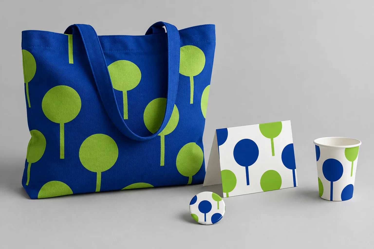
Blue eco bag with circle and stem pattern, thank you card, badge, paper cup
ExpansionThe same pattern continues with sponsorship thank-you cards and event goods. We proposed that the language that started on the homepage could be expanded to other contact points of the foundation.
05 / DESIGN DIRECTIONSSame brief, four forests

Before drawing one correct answer, we laid out
four possibilities.

Even if you start with the same facts and the same palette, the personality of the website varies greatly depending on what you show first. I drew the main page to the end in four directions: the language of symbols, a person's day, the number of trust, and the energy of participation.

The screen below is the actual design draft. When you scroll down, the main page in each design moves from top to bottom.

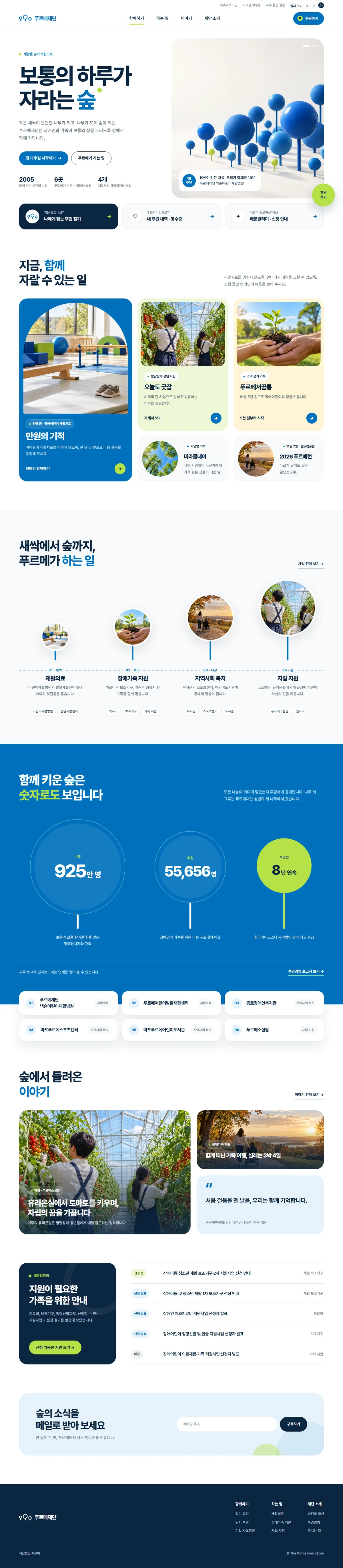
final offer

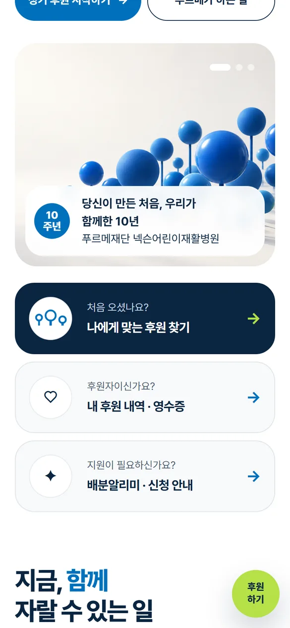
Growing ForestGrowing Forest

The three trees of the symbol have been expanded to include the language of the entire website. The circle becomes a frame to hold photos and numbers, and the stem becomes a line that connects the story.

  • The three-pronged home screen is divided according to the purpose of the visit.
  • Numbers shown by the three trees of the symbol
  • Introduction to business from sprout to forest
Pretendard ExtraBold · White background
Proposal A Purme Foundation main page created in the direction of a growing forest
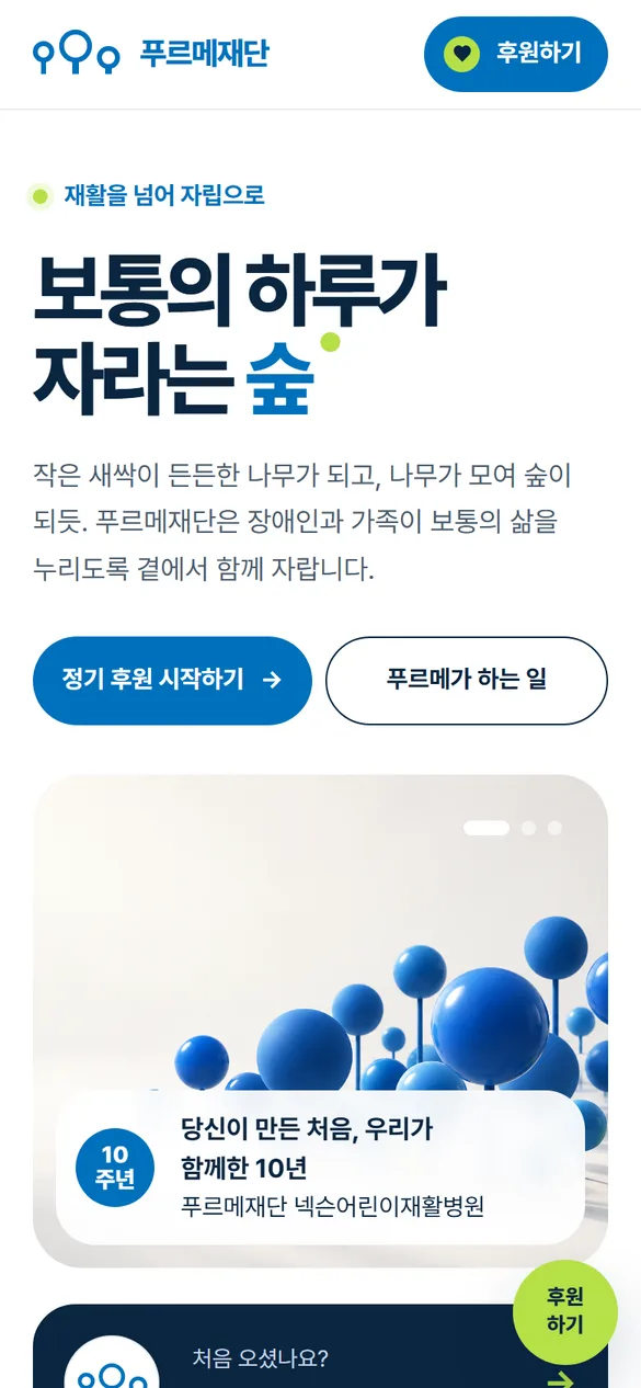
Proposal A mobile home screen
navigation design proposal

Ordinary DaysOrdinary Days

The goal is to follow the day-to-day lives of people with disabilities and their families, as if reading a magazine. The big Myeongjo title and documentary photos tell the story first.

  • Cover photo and the first screen that opens with “In this issue”
  • From the treatment room in the morning to the house in the evening, four projects to read through the hours of the day
  • Numbers read with the same background and footnotes
Noto Serif KR · Pretendard
Proposal B Purme Foundation main page designed for a typical day
Proposal B mobile home screen
navigation design proposal

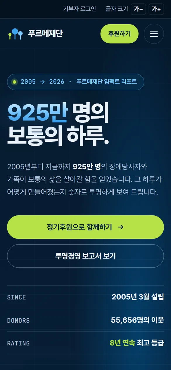
Clear NumbersClear numbers

The reason for deciding to sponsor started with trust. Like an annual report, numbers and the flow of time are placed on the first screen.

  • The first screen showing 9.25 million people as dots
  • Time bar since 2005
  • Blue and lime data on dark background
Pretendard · Mono label
Proposal C Purme Foundation main page created with transparent numbers
Design An C mobile home screen
navigation design proposal

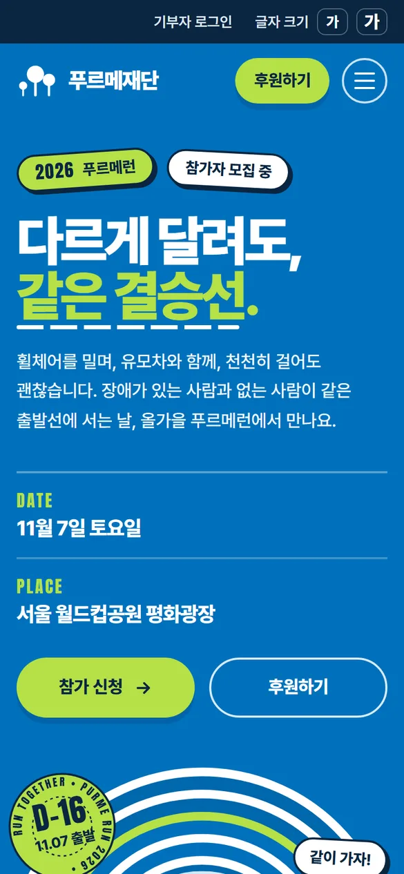
Run TogetherRun together

We transferred the energy of Purme Run to the entire website. The curves of the track and large letters invite the viewer to participate.

  • Blue home screen where track curves surround the photo
  • Campaigns and projects leading to LANE 01~04
  • Scoreboard numbers with finish line pattern
Pretendard Black · Anton
Proposal D Purme Foundation main page designed to run together
Design An D Mobile home screen
DECISIONWhat criteria did you choose?

Look inside the pretty design
A design proposal that won't get you lost .

The four design proposals were evaluated together based on six criteria. The most important criterion was whether families needing support could find their way through the first screen. This is because among the people who visit the foundation's website, they are the most urgent.

Evaluation criteriaA · Growing forestB · Ordinary dayC · Transparent numbersD · Running together
Consistency with CI
Understanding as a first-time visitor
Road to Sponsorship
Finding a path for families in need of support
Operation and expansion
Accessibility
B · Ordinary day

Photography standards and story cards

C · Transparent numbers

Transparent management area that puts numbers first

D · Running together

Campaign Page Energy

A · Growing Forestfinal proposal

The advantages of the design proposal that were not adopted were not discarded and were transplanted into A.

  1. 01ListeningExploring foundation materials and operating website
  2. 02SharingDefining three reasons for visit
  3. 03EstablishingBringing out the brand language from the symbol
  4. 04DrawingFour main page design ideas
  5. 05ChooseEvaluate together based on six criteria
  6. 06RefiningOrganizing sponsorship flow and accessibility standards
06 / DONATION FLOWSponsorship in three choices

One entrance,
three choices.

We have gathered all the scattered sponsorships into one and organized them so that you can proceed to the application form by simply selecting the method, amount, and place to donate your heart. You can view it by pressing it directly on the right screen.

  • The first screen does not ask for the amount.
  • You can revert your selections at any time.
  • We will show you once more what you selected before applying.
  • You can go all the way with just a keyboard.
Growing with PurmeDesign draft screen
1How will we work together?
2How much should I add?
3Where should I put my heart?
Selected content30,000 won per month · Rehabilitation medical care
Fill out the application
07 / INFORMATION ARCHITECTUREThe menu is like a tree

From a menu listing materials, to
a menu for selecting things to do.

The menu name was changed to more closely reflect the purpose of the visitor rather than the organization chart of the institution. 「Data Center」 was changed to 「Story」, a collection of people's stories, and 「Participation」 was changed to 「Together」, meaning to be together.

Purme Foundation
Existing 「Participate」Join
  • regular sponsorship
  • One-time donation
  • Ongoing campaign
  • anniversary donation
  • Corporate Social Contribution
  • My donation details and receipts
Existing 「Business Introduction」What we do
  • rehabilitation medicine
  • Support for families with disabilities
  • community welfare
  • Self-reliance support
  • 6 Purme institutions
Existing “Data Center”Story
  • story
  • press release
  • Newsletter · Newsletter
  • gallery
  • publishing
Existing 「Introduction to the Foundation」Introduction to the Foundation
  • Vision and Mission
  • History
  • Transparent management
  • Organization / Public Relations Ambassador
  • employment
  • Directions
Separately at the top of every screenFind support

Distribution notification · Application guide · Easy article guide

08 / ACCESSIBILITYIf it is the homepage of the Foundation for the Disabled

Accessibility is not a feature
but a Foundation attitude.

Any foundation that talks about the ordinary lives of people with disabilities must be able to use its website, starting from the website. Before starting design, we first set accessibility standards and checked all design proposals against those standards.

  • 4.5:1Compared to 9 people

    The text and background must be 4.5:1 or higher.

  • Tabkeyboard movement

    You can even apply for sponsorship without a mouse, and you can clearly see your current location.

  • Altalternative text

    For each photo, a text is written to describe the scene, and the story is told through a screen reader.

  • A+font size

    Even if you increase it to three levels, the lines will not overflow or the buttons will not overlap.

  • Motionreduce movement

    Turning on Reduce Motion on your device will stop the decoration animation.

  • easy writingEasy article guide

    Application notices are also provided in sentences that are easy for people with developmental disabilities and their families to read.

TRY IT · View in easy text

Information on the 2nd application for the rehabilitation assistive device support project

We provide support for the purchase of assistive devices necessary for the rehabilitation of disabled children and adolescents. After checking the application qualifications and documents to be submitted, please submit the application form and supporting documents within the designated period. The selection results will be announced in the distribution notice.

Help with money to buy assistive devices

  1. Do you need assistive devices that fit your body?
  2. Check first whether you can apply.
  3. Prepare the application form and documents.
  4. Please send it by the specified date.
  5. The results will be announced in the distribution notification.

This is an example phrase. Easy writing is based on the principles of short sentences, one piece of information per sentence, and picture numbers.

DESIGN SYSTEM

Parts that grew in the same forest

Buttons and tags, cards and even number trees. We organized it into parts so that the same screen can be created even if the person in charge of the campaign changes.

CAMPAIGN TEMPLATE

Even if the campaign changes,
the forest is the same forest.

A campaign name, a representative scene in a circle, a one-sentence promise, and a participation button. As long as the four positions are maintained, it can be read as a campaign from one foundation even if the colors and pictures are different.

Support for rehabilitation treatment for disabled children

10,000 won
Miracle

So that children do not stop receiving rehabilitation treatment.

Join us for 10,000 won every month
Independence of youth with developmental disabilities

Today too
Good job

Every day you go to work, you become independent.

Support Good Job
Small regular donations

Purme
Jeoggumtong

From 5,000Won

A small piggy bank nurtures a child's dreams.

Start with 5,000 won per month
anniversary donation

Miracle
Day

The day when my anniversary becomes someone's miracle.

Share your anniversary
November 7 · Seoul World Cup Park

2026
Purme Run

Even if you run differently,
to the same finish line.

Apply to participate
09 / MOBILEWith one hand, all the way

Even on the screen in your hand
there are three paths.

In many cases, the first place you open a website is your mobile phone. On small screens, the three paths are placed directly below the first screen, and the sponsorship button is placed at the bottom right, where the thumb can reach.

  • Campaign cards that run vertically
  • Sponsor button at the thumb's reach
  • The number trees are arranged vertically one at a time.
  • Font size can be adjusted within the menu as well.
Proposal A mobile home screen
Proposal A mobile three-way area
Proposal A mobile number tree area
10 / AND TODAYSuggestions remain suggestions, questions remain

The renewal proposal
was not finally adopted.
But questions remained.

The Purme Foundation website continues to operate in its current structure, and BlueCanvas continues to manage campaigns, announcements, and sponsorship pages.

The questions raised during the proposal process still serve as operational standards. Start by asking who comes to this screen, what needs to be shown first, and what you need to make sure no one gets lost.

NOW OPERATINGPurme Foundation website in operation

Campaign banners, distribution notices, and even transparent management numbers. News from the foundation is constantly updated here.

Visit purme.org
YOUR ORGANISATION, SEEN WITH CARE.

What forest is growing in your organization?

The homepages of foundations, public institutions, and non-profit organizations are used by all sponsors, users, and employees.
Let's start with who is coming.

Client
Purme Foundation
Scope
Research, information architecture, brand experience strategy, UI design, accessibility standards, motion prototypes
Brand
CI and symbol: Provided by Purme Foundation · Interpretation and web application: BlueCanvas
Status
Renewal proposal (finally not adopted) · Management of the currently operating website

Contact

A rough idea is a good place to start.
Let’s shape your project together

Tell us where you are and what you want to achieve. We’ll outline a practical scope, process, and estimated budget.

4 questions · about 2 minutes

Scope

What would you like to work on together?

Select as many as apply. If you are not sure yet, choose “Other”.

Budget

What budget range do you have in mind?

Even a rough range helps us shape the proposal.

Project details

Tell us where you are right now.

It does not need to be polished. Tap an item below and the outline is filled in for you.

0

Upload up to 2 RFPs or reference files. Supported: PDF, PPT, Word, Excel, JPG, PNG, ZIP

Contact

Where should we reply?

Scope, budget, project details and contact information are required.