It starts with people.
Lifestyle and space needs are put at the beginning of the story of the work. Instead of just looking at the results, have them read the reasons for their choices.
ZIUMN
Brand website
Planning · Design · Development
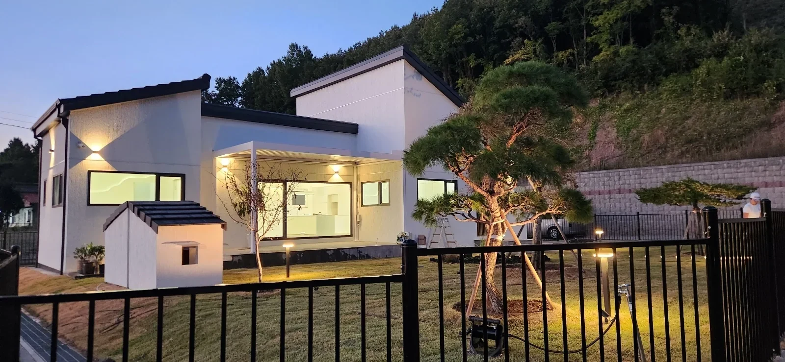
FROM A WAY OF LIVING, TO A WAY OF SEEING.
ZIUMN's materials contained stories of different houses and the people who would live in them. Sa Ae-heon's space for his dog, the scenery in the window of Sojaejae, and even the courtyard of Pyeonggyeongjae. The reasons for choosing each work were different.
The difference had to be visible on the website as well. Beyond putting the photos together, I organized it so that you can understand why this space was built like this.
Visit the completed homepageStarted from a data image
Each work tells a different story.
Different design directions were developed
Appearance, life, light, materials.
The criteria for selecting an image are also part of the brand.
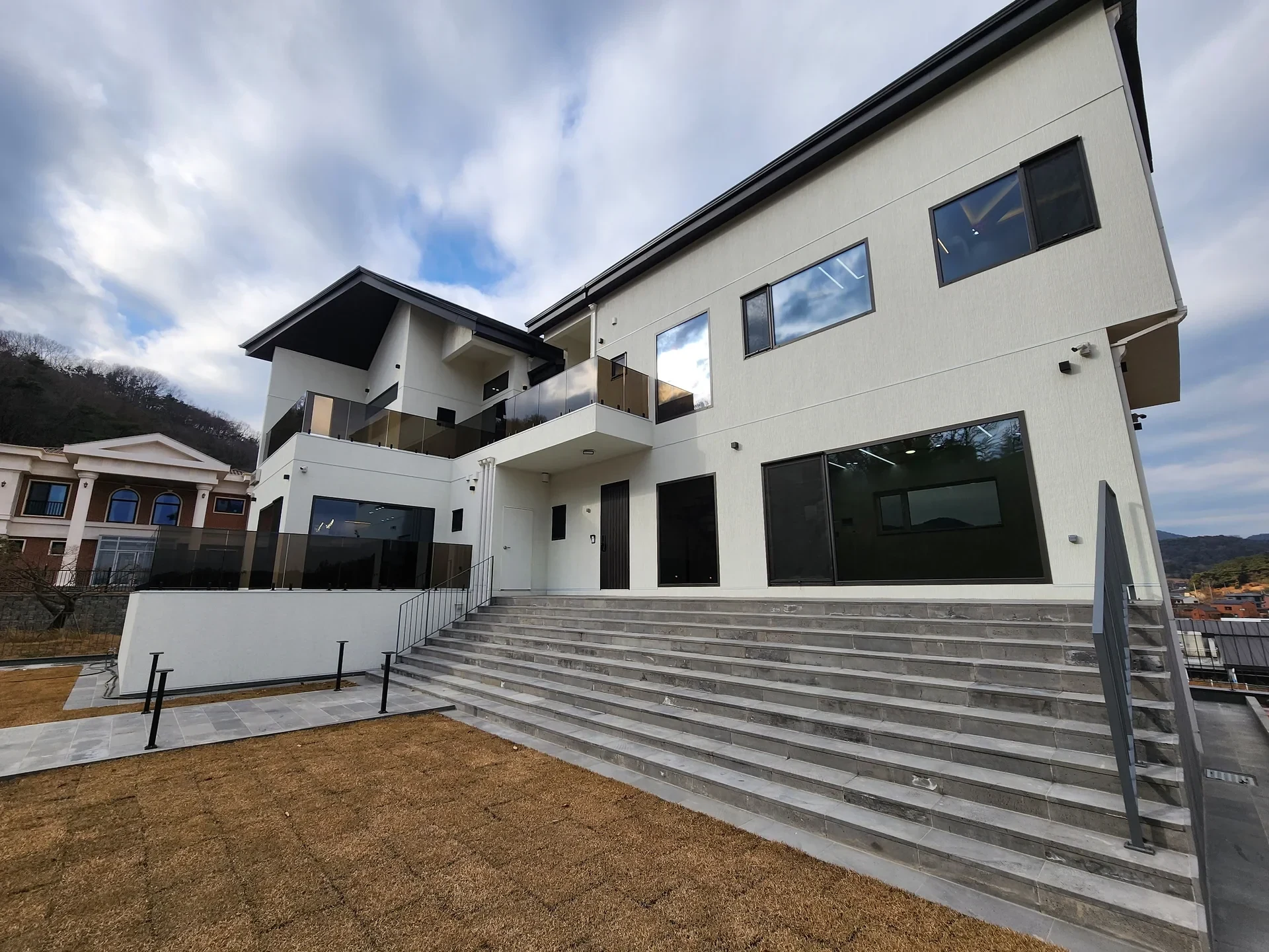
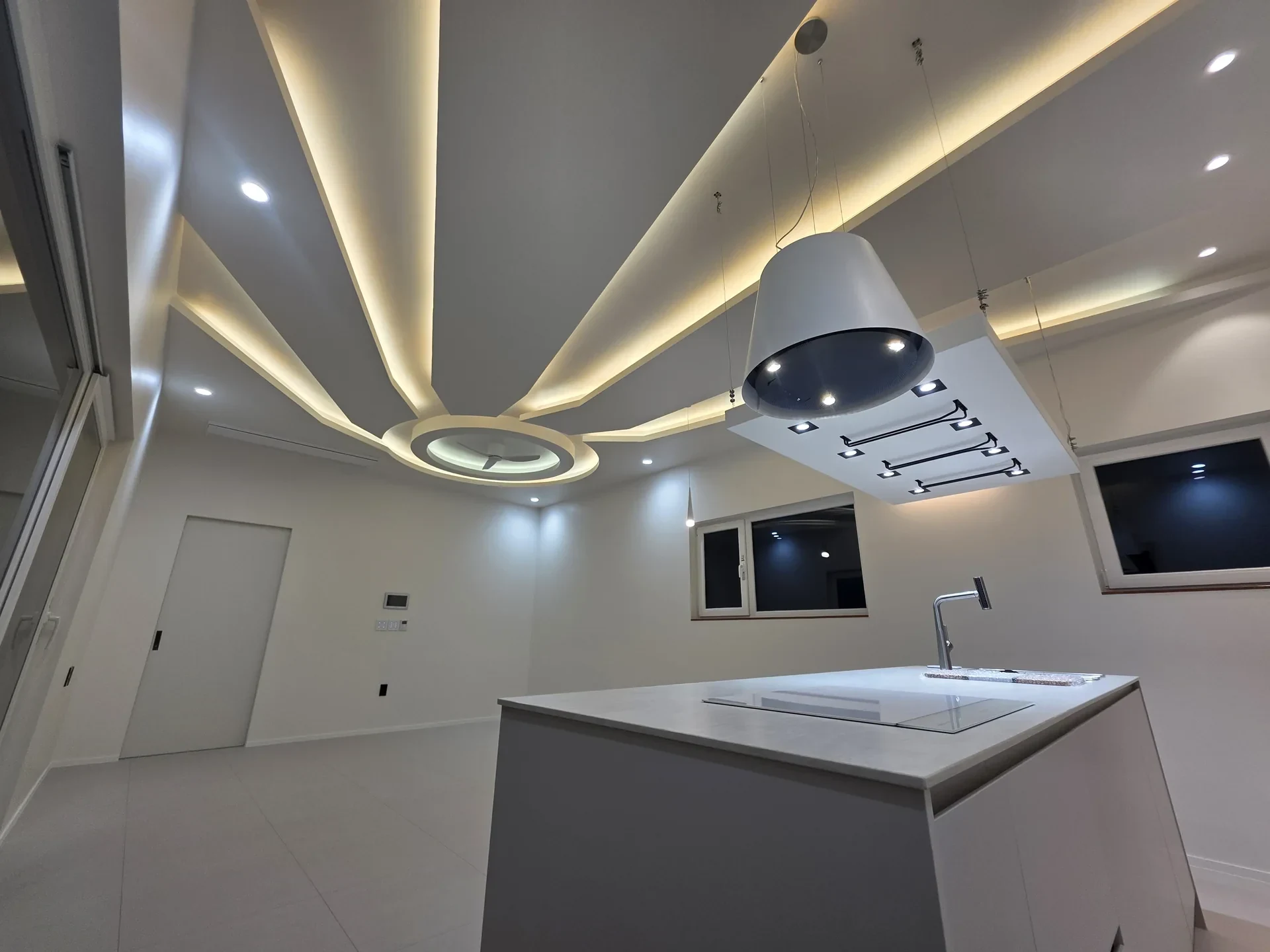
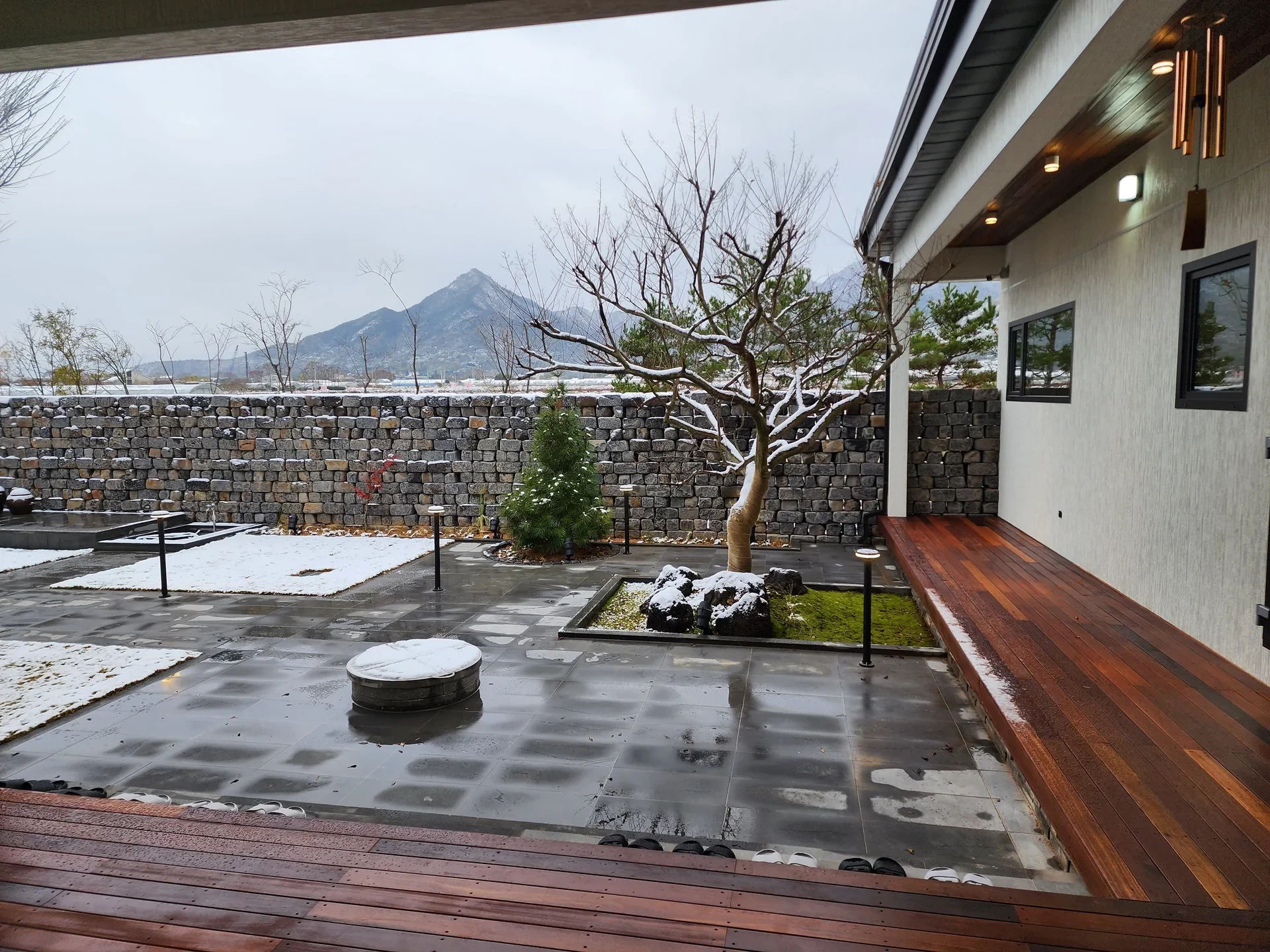
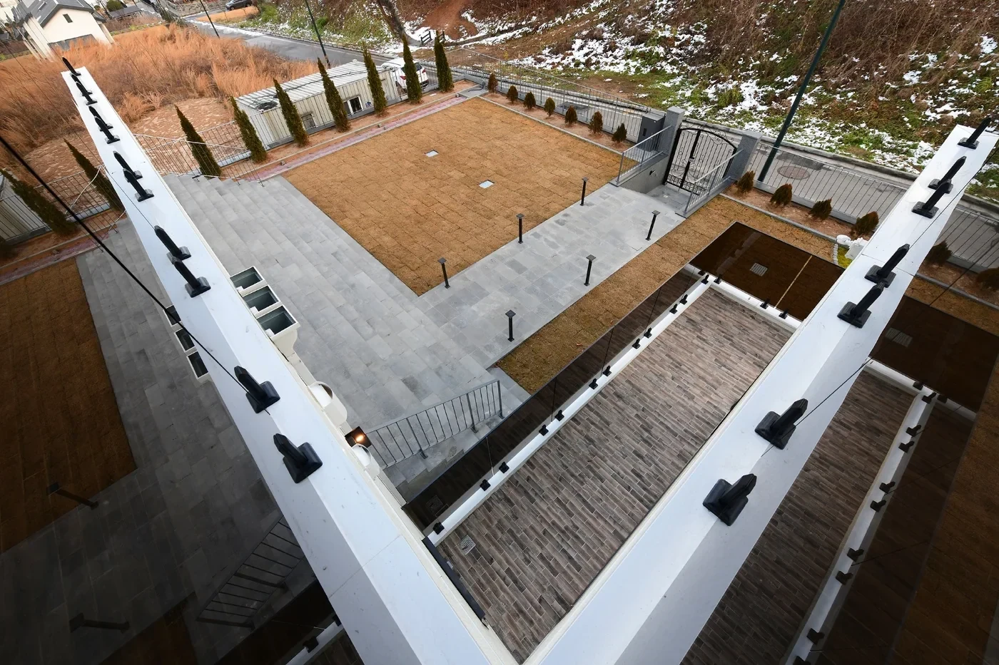
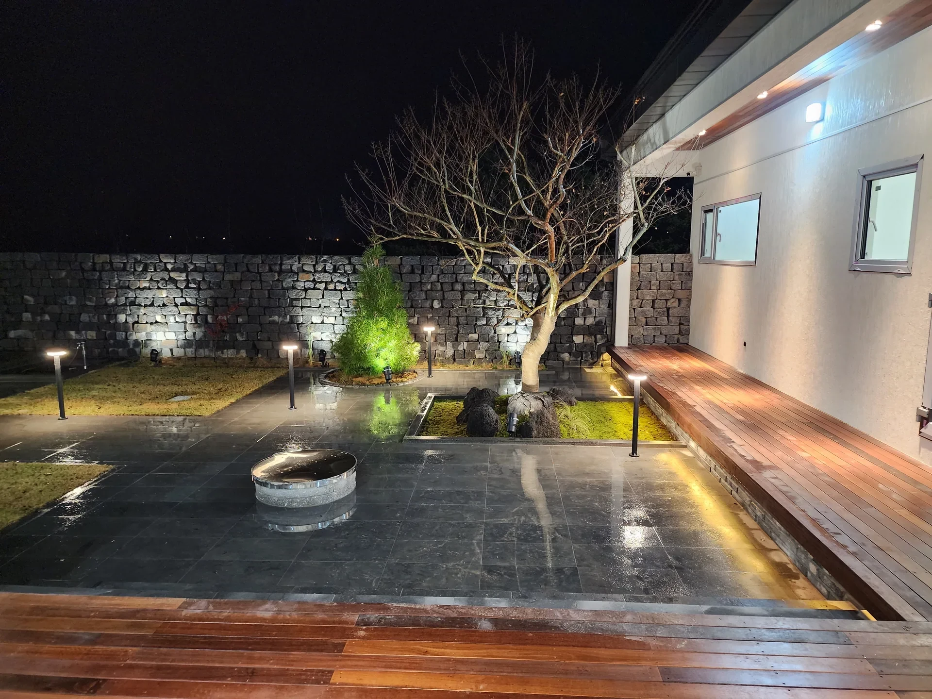
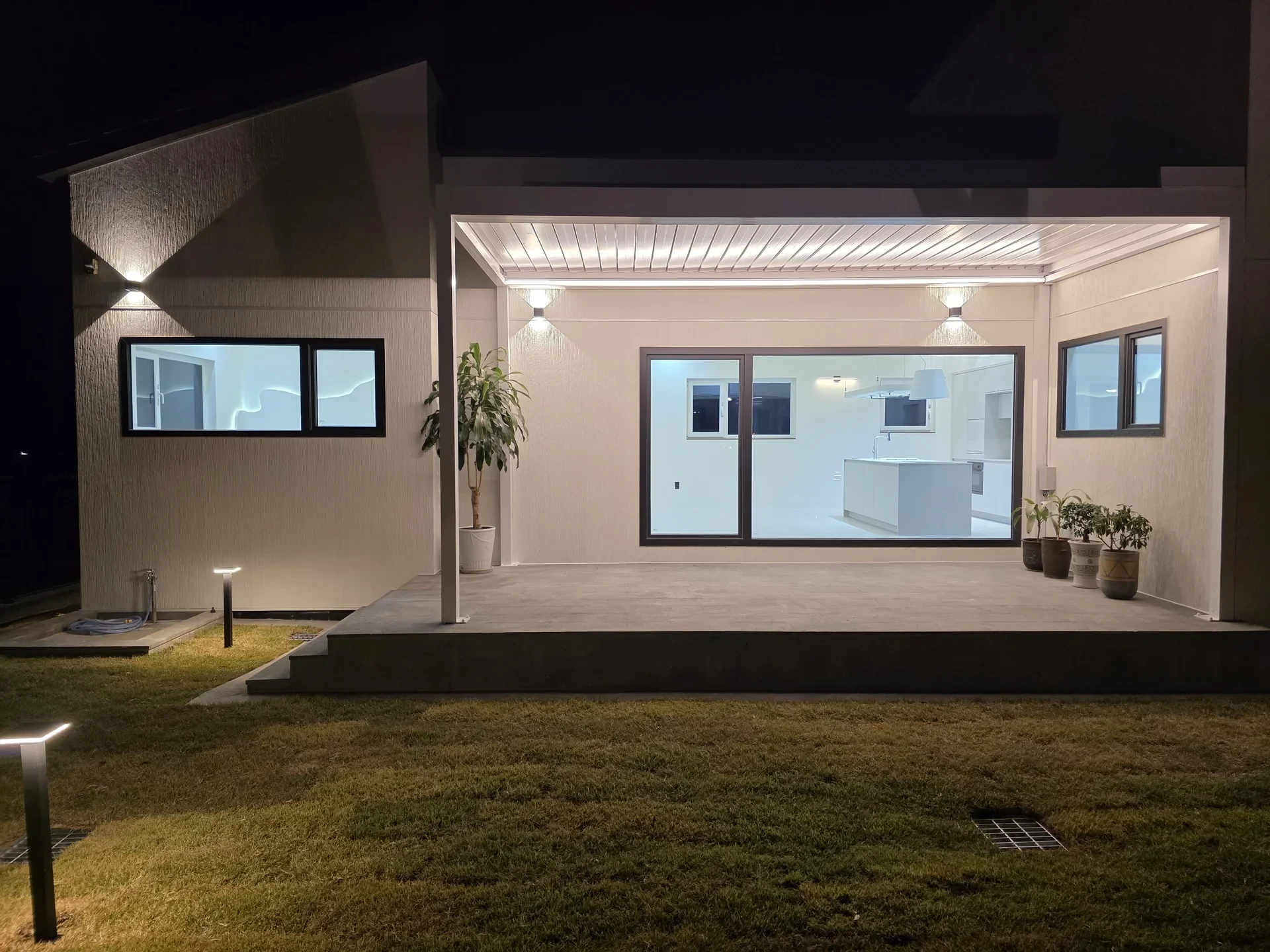
The focus of the brand was on ‘the people who live there’ rather than on ‘awesome architecture’. So the first sentence also starts with the order of life rather than focusing on the scale or technology of architecture.
The existing brand name and individuality of the work were maintained, and on the web, the size of the photo, tone of sentence, space and movement were tailored to convey the same attitude.
Lifestyle and space needs are put at the beginning of the story of the work. Instead of just looking at the results, have them read the reasons for their choices.
Remove decorations and repetitive boxes on the photo. Let the scenery, light and materials create the impression of the scene.
It allows you to move naturally from the work you like to the brand's thoughts, and from the work process to project inquiries.
Life comes first,
space comes next.
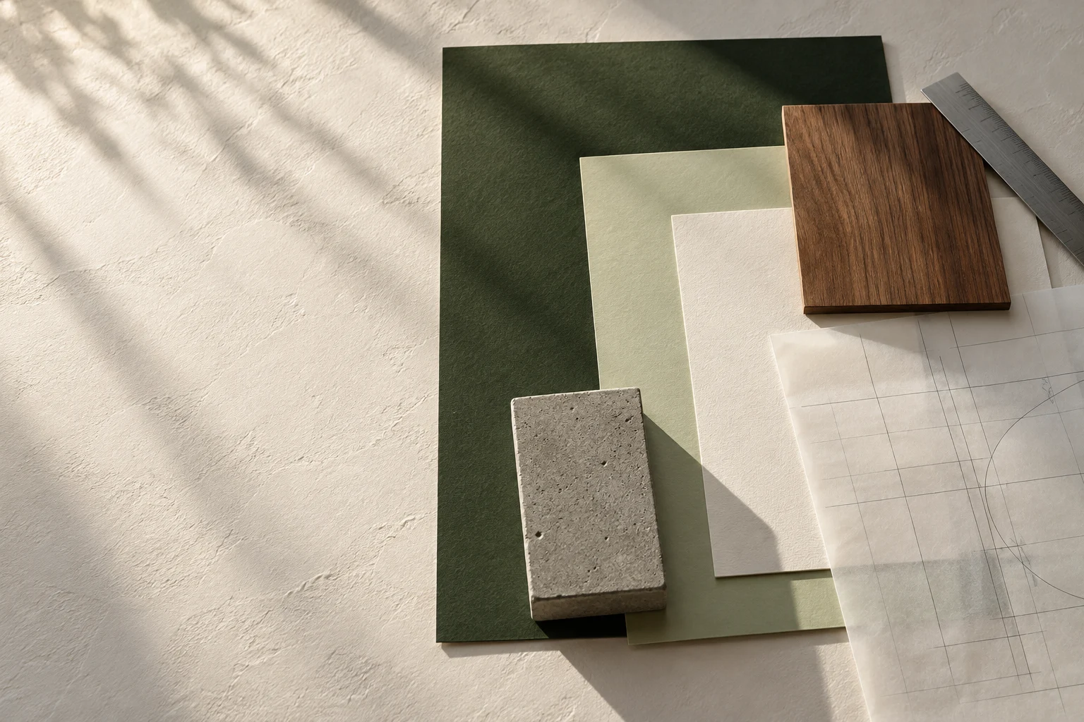
Wood and stone, wall and paper.
We looked at the color temperature that goes well with different textures.
Dark olive makes the light in the photo clear, and sage creates a zone where the eye rests. Long text is placed on soft white. The point where the color changes is also the point where the scene in the story changes.
It brings out the light and dark in the photo of the work and supports the transition between scenes calmly.
Green is used for sentences and lines. It is in line with the brand's attitude of considering landscapes and gardens together.
It is the basis for showing line drawings and spatial stories. Add brightness to dark photo scenes.
This is the color in which work descriptions and long sentences are placed. It blends into the photo more smoothly than pure white.
Myeongjo creates the impression of reading a story, while sans-serif creates the impression of clearly showing the space. The final draft focuses on a large sans-serif title and adds the softness of italics to the secondary English text.
A space that contains life.
The form is clear and the sentences are simple.A space that contains life.
Slow-reading titles and wide margins.A life, well framed.
The way you immerse yourself in photography, the way you read it like a magazine, the way you start with a model and light, the way you structure information and work. Even with the same material, first impressions and reading speeds vary.
The design proposal below is the screen that was actually produced. You can compare what each direction emphasizes and even open the design to see the movement.
Open the photo of the actual house larger and scroll from the exterior to the interior. The direction is to allow people to experience the space built by ZIUMN first.
Bold Sans Serif / Olive / Photo FocusView the proposalRead the work slowly with the Myeongjo title, paper-like background, and ample space. I attached a story next to the photo to check for a calm impression.
Myeongjo / Warm Ivory / Asymmetric EditView the proposalThe architectural model and daylight were used as the first scene. Before introducing the actual work, this is a direction that visually shows the process of transforming thoughts into space.
Large Myeongjo / Neutral / Transition of TimeView the proposalA combination of ZIUM& notation, geometric lines, work cards and step-by-step instructions. The direction is to help you understand everything from the brand philosophy to the work process.
Sans Serif / Sage / Geometric StructureView the proposalIn the first confirmed design, a photo of the actual work creates the first impression. The large title briefly conveys the brand's attitude, and the scroll continues from the outside to the inside of the space. The stories and information examined in other designs are also continued through the introduction of the work and the work process.
The picture gets bigger and the gaze moves inward.
It contains the order of experiencing the space in one scroll.
To ensure that the immersion from the first screen continues on the next page, we linked the work, brand introduction, building process together, materials, details, and inquiries. This is the order in which the person who appreciates the work can think of their own project.
We distinguish between houses, interiors, and commercial spaces, and the stories of each work are continued on detailed pages.
Divide the materials into the exterior, interior walls, and interior of the home to help you understand what is being considered.
The lives of the two building owners and their dog determine the composition of the windows, yard, and space.
The position and proportions of the windows and the different shapes in each space tell the story of the house.
The yard, deck, and even the light at night are shown as one living scene.
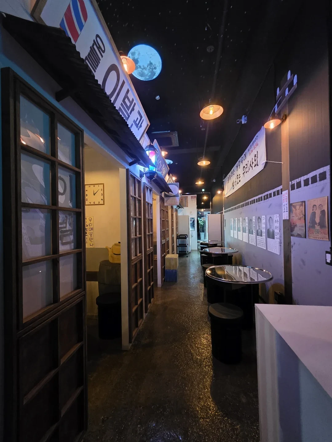
The atmosphere of homes and other commercial spaces also continues within the same brand.
The horizontal expansion of the PC was not reduced to a small screen. The work runs vertically, and sentences remain at a readable size. It allows you to browse works and stories with one hand and move to the next page.
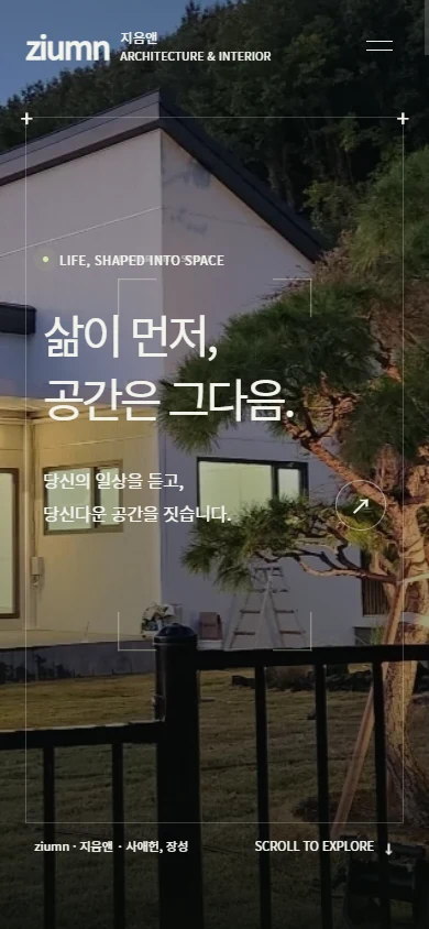
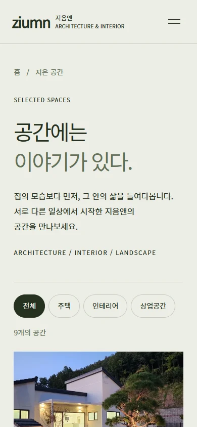
From the first impression, the order of reading the work, the color and movement.
All connected as one on ZIUMN's homepage.
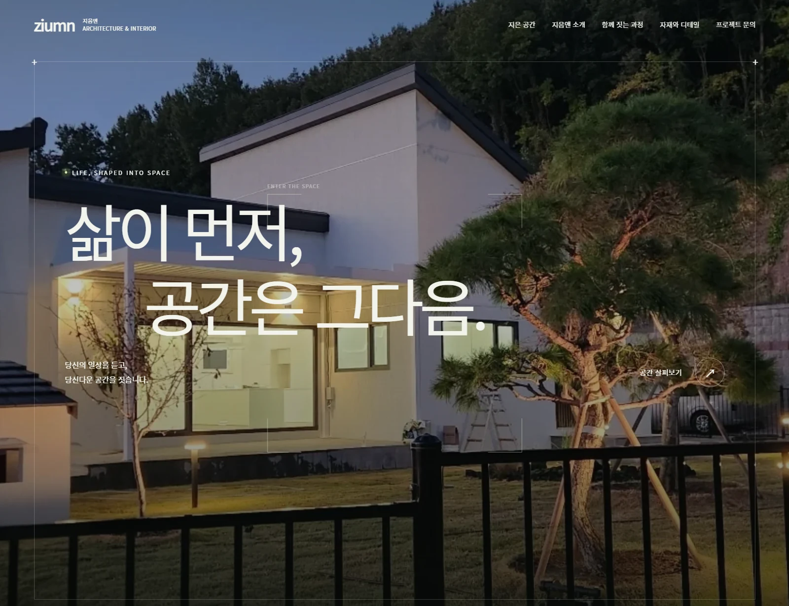
Let's take a look at the photos we have, the stories we haven't yet organized, and even the direction we're considering.
Contact
Tell us where you are and what you want to achieve. We’ll outline a practical scope, process, and estimated budget.
DIRECT
Your inquiry has been received. We will reply within one business day with a scope and an estimate.