University/research institute researcher
Check to see if there are any vacancies you can apply for now and when applications close.
KOREA DRUG DEVELOPMENT FUND · 2021 → 2026
This is the record from 2021, when the Korea Drug Development Fund website was first created, to 2026, when it was redrawn.

2026 confirmed planFirst screen currently in operation
In January 2021, the pan-ministerial new drug development group started anew as the Korea Drug Development Fund. The pan-ministerial new drug development project, which has been ongoing for 10 years, has been completed, and the national new drug development project and the COVID-19 treatment and vaccine new drug development project have been jointly led.
Records of completed projects and announcements of new projects had to be together on one site. It was also clear why researchers and companies were visiting this site. Check the announcements that you can apply for now, download the form to submit, and check which projects are being supported.
So rather than a screen that nicely introduces the organization, we first designed a screen that would get the job done quickly.
Visit the operating websitebusinesses included on one site
We drew 9 main design proposals
5 plans for 2021, 4 plans for 2026
We have been operating together for over 9 years.
2021 · A NEW NAME
Pan-Ministry New Drug Development Project Group
Korea Drug Development Fund
The business group that has been in operation since 2011 started anew as a foundation in January 2021.
The first sentence of the first design of 2021 was also this news.
Before we started designing, we divided our visitors into four categories and wrote down what each of them wanted to do first. Information with the most overlap takes the front row on the first screen.
Check to see if there are any vacancies you can apply for now and when applications close.
Compare the scope of support, programs, and commercialization support content.
Download regulations and forms, and find frequently asked questions and training and event schedules.
Read business results, press releases, and monthly newsletters.

We looked for a color that would build trust in public institutions on top of the precise and calm texture of a laboratory.
CI used the original version held by the foundation, and on the web, a separate motif was created that interpreted the flag's columns.
Korea Drug Development Fund's CI is made up of squares going from light blue to dark blue, with a flag going up to the right. We interpreted this CI as two rules to follow on the web.
Like the development of a new drug that goes through each stage one by one, the information was laid out in an orderly manner. The direction of progression is always from left to right.
Bright blue is used in places that call for action, such as buttons and notices, and dark blue is used in places that build trust, such as titles and backgrounds.
The more blue you use, the duller it becomes. So, we assigned each color to its own role and did not use it outside of its role. Coral does not exceed 2% of the entire screen.
Background of the hero and achievement areas. In the 2026 confirmed plan, it takes up one-third of the screen.
Used for clickable elements such as buttons, links, and tabs. Taken from CI's dark blue.
Brightly connects the blue in gradients and graphs. The upper part of CI is light blue.
It is the basis for long-reading areas such as announcement lists and cards.
Use sparingly only when distinguishing information of a different nature, such as research or industry trends.
The first screen of 2021 was more of a bulletin board on a light gray background. In 2026, dark blue will take up one-third of the screen, and the proportion of blue will increase more than seven times.
The entire main screen of the two final proposals was categorized and measured based on color tokens.
Requests regarding font size were repeated several times in the 2021 feedback. In the 2026 renewal, the text was set to 16px or larger, and the size difference between the title and numbers was widened to make it easier to scan.
Successful new drug development is the future of
Korea.
The first two designs started with a large image announcing the new name. In the third design, the image was removed and the business announcement was posted as the main character on the first screen. The screen below is the original design created at the time.
A transparent image of cells was spread across the first screen, and the news of the name change was posted as the title. The foundation's introduction was written on a gradient card flowing from light blue to blue.
The first impression was brighter, but announcements and notices were pushed to the bottom of the screen.
The dark blue background and DNA image gave a strong impression of cutting-edge bio. The notice was attached in the form of a strip right below the hero.
The impression got stronger, but the distance to the information I was looking for remained the same.
We removed the large image and posted the business announcement as the largest card on the first screen. You can check the application period and progress status right within the card.
The main character on the first screen has changed from an image to an announcement.
The menu was organized into notifications, business information, foundation news, and foundation introduction, and the project group pipeline and research trends were posted on the first screen.
Menus began to be called in the language used by users instead of in the organization's internal language.
We lined up the three businesses on the first level of the menu and showed all subpages at once in a dropdown menu. Facebook, YouTube, and newsletter subscriptions are collected in one line.
Users can now start the business they are participating in right away.
I re-read the revision request documents exchanged with the foundation from May to August 2021. Rather than completing the request on one screen, we changed the request to a rule that would apply to all subsequent pages.
There was a request to display all notice titles on one line, and to display the latest trends and support tasks as a list.
The main screen is for quickly browsing through the list.
We decided to create a new business announcement bulletin board and add application start and closing dates, as well as head search for each project.
An announcement is data with a period and status. Once the deadline passes, the status automatically changes to ‘Closed’.
The request was to include the vision, goals, scope of support, promotion strategy, and promotion system in order on one page.
The business introduction is read as one flow within one page.
The request was to make the menu and body text slightly larger, and to separate all submenus with tabs.
Easiness to read is given priority over decoration.
The request was to distinguish the three promotion strategies with different colors within the same blue color scheme.
Divided by brightness within the same series.
The request was to shorten the length of the long history, group it by period, and keep the lines connecting the years unbroken.
Even long records can be read in a short amount of time.
The request was to gray out the pan-ministry new drug development project that has already ended and distinguish it from the other two projects.
Break out completed business and leave a record.
The most elaborate part of the business introduction page was this one line depicting the entire cycle of new drug development. The progress direction is read first rather than the table to see which program helps at which stage.
Pipelines are the foundation's most frequently updated data. The screen has been changed to a table by development stage in 2021, a bar graph by treatment area in 2023, and a numerical summary and integrated search in 2026.
Each development stage was divided into columns and tasks were stacked on cards.
A line comparison of the distribution of development stages and modalities across therapeutic areas.
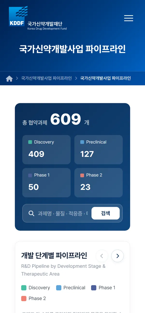
The total number of tasks and the number of stages are displayed first, and you can search by task name, indication, target, and performing organization at once.
Public figures from the Operating Pipelines page (as of October 2026).
Over the past five years, the foundation's business has increased. From the SEED creation platform, CMC infrastructure, new drug R&D commercialization support, and education/event applications, the first screen has expanded to provide guidance.
We maintained the principle of ‘announcement first’ established in 2021, and explored four ways to show performance and pipeline in numbers and graphs.
Immediately after the announcement card, the foundation's four values were followed, followed by achievements, pipeline, and the latest news.
Friendly order for first-time visitors
View the proposalPerformance numbers and pipeline graphs were placed right below the announcement, and the foundation introduction was moved to the end of the page.
Quick turnaround for frequently visiting researchers and companies
View the proposalThe news was laid out calmly, divided into four sections: large titles aligned to the left, white list-type announcements, donut graphs, and YouTube.
The impression is neat, but the presence of the announcement has weakened.
View the proposalBased on the order in Proposal B, the business announcement card was changed to the darkest navy blue so that it caught the eye first on the screen. The foundation introduction is placed right before the inquiry.
Confirmed plan · Currently in operation
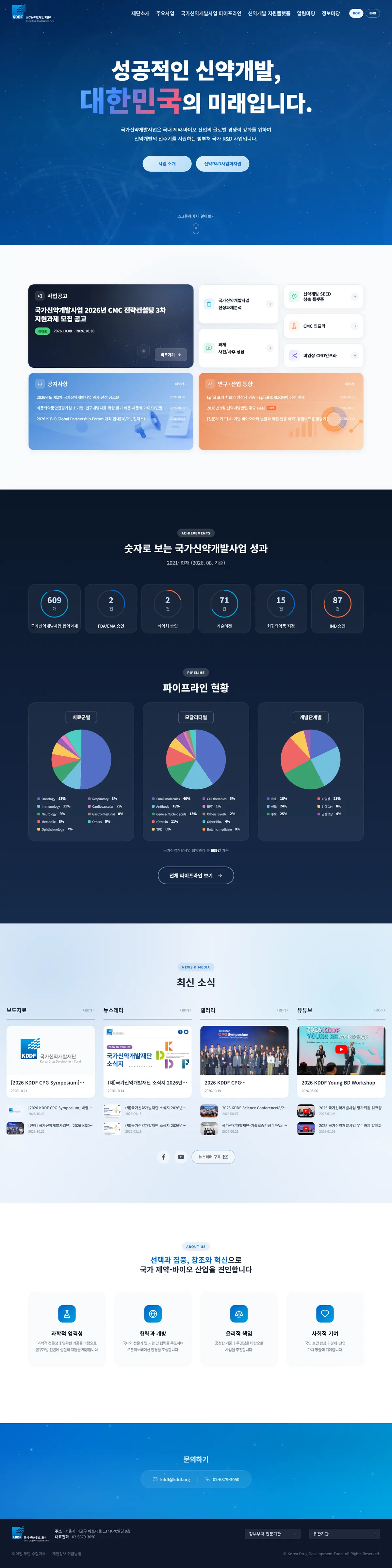
View the proposalEach area of the final plan follows the rules set for 2021 and the new priorities set for 2026. We will introduce the actual operation screens divided by area.
An announcement of an ongoing business was posted on a dark blue card, and an application period and progress badge were attached. Below we have collected shortcuts frequently used by researchers and companies.
Achievements such as agreement tasks, technology transfer, and IND approval are shown as circular indicators, and the pipeline is divided into three circular graphs: treatment group, modality, and development stage.
Press releases, newsletters, galleries, and YouTube are divided into columns of the same height, allowing you to select the news you want right away.
Show all subpages at once in the drop-down menu. Terminated projects were marked as ‘ended’ to distinguish them from ongoing projects. The rules established for 2021 have been continued.
The announcement list, pipeline, business introduction, history, and event application were all reorganized using the same header, tab, and table rules.
Checking deadlines for announcements often happens while you're on the go. On mobile, submenus are replaced with horizontal swipe tabs, and Pipeline gathers the total number of assignments and a search box into one card.
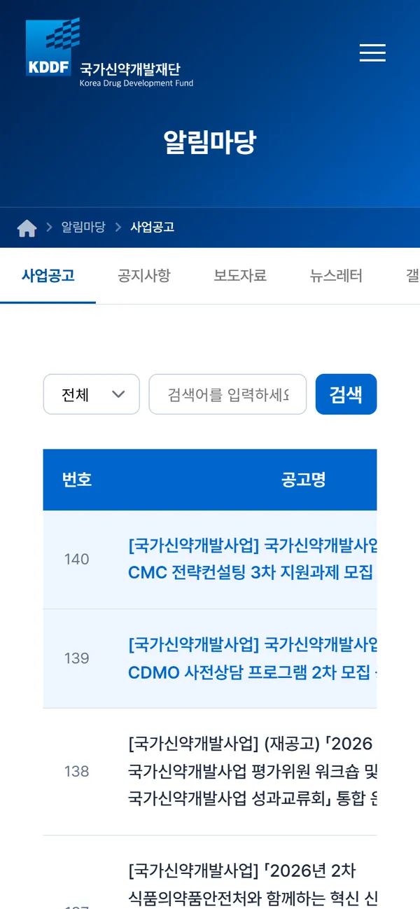

The website of a public institution must change whenever its business changes. Even after opening, we are working with the foundation to add new business pages, create newsletters, and receive event applications.
We designed the main and subpages, and created a business announcement bulletin board and automatic shutdown function.
The locations of the foundation and the evaluation center were provided along with a map.
I was in charge of designing the monthly newsletter and card news.
The task distribution was redrawn as a bar graph by treatment area and development stage.
CMC infrastructure information and training/event application pages have been added.
We have re-created a tech fair site that connects the technology of overseas organizations and domestic companies.
We have created a Korean website for the new drug development SEED creation platform.
The National New Drug Development Project introduction page has been revised to reflect the changed business details.
The order and impressions of the first screen were explored again in four directions.
While operating the final plan, we also manage the sending of notification emails and newsletters regarding the completion of applications for training and events.
From researchers checking announcements to citizens reading newsletters, take a look at the
Korea Drug Development Fund website.
If you are thinking about the homepage of a public institution, foundation, or research support project,
let's take a look at the materials we have and requests from users.
 Public · PlatformKDDF SEED Platform A project application and matching platform supporting early-stage drug-discovery initiatives.
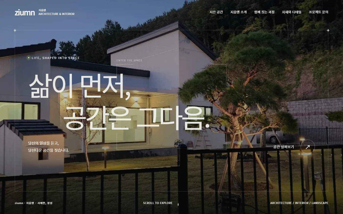 Architecture · InteriorZIUMN The build process of an architecture brand website, from the brand’s attitude to its olive color and typefaces, four proposals and scroll interactions.
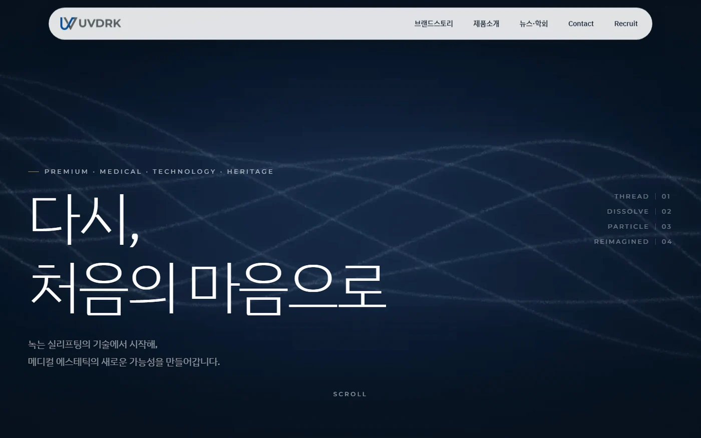 Medical · BrandUVDRK The design process of a medical aesthetics brand website, from reading the name to color and motion rules and three proposals.
Contact
Tell us where you are and what you want to achieve. We’ll outline a practical scope, process, and estimated budget.
DIRECT
Your inquiry has been received. We will reply within one business day with a scope and an estimate.


