Request a project consultation

UVDRK Brand WebsiteAgain,
With the first heart

We designed the first website of UVDRK, a medical aesthetic brand that started with melting thread lifting technology. We summarized the process of interpreting the name and story, establishing rules for color and movement, and verifying the direction in three designs.

Client
UVDRK Co., Ltd.
Industry
medical aesthetics
Scope
Planning/information structure, web design, motion graphics, front-end development
Period
2026.09 – In progress

01 Overview

A new company,
technology that is not new

UVDRK is a medical aesthetics brand established in July 2026. The company may have just opened, but the brand's roots are traced back to the meltable thread lifting technology pioneered by Ultra V and to the doctor who started it. It's in Kwon Han-jin's experience.

So this website had to show both things at the same time. It is the trust that comes from long-proven experience and the will to go back to the beginning and start again.

  1. 01

    Trust without exaggeration

    Ultracall, thread lifting, RF equipment, and infusion pumps are all medical devices. In this field, the more you talk about effectiveness, the less trust you have, so quality had to come from moderation, not the size of expression.

  2. 02

    Two stories in one name

    The heritage of Ultra V and Dr. Kwon Han-jin's leap forward comes together in one name: UVDRK. However, we had to keep the boundaries of the narrative so as not to mix the individual's career with the history of the new corporation.

  3. 03

    Products with different textures in one voice

    From a single strand of thread to RF equipment, skin boosters, and daily cosmetics, each product line has a different personality. We needed a visual convention to tie these products together with a single tone.

  • 23Delivered plan
  • 578Product/brand data files
  • 13Thread lifting product line
  • 5Skin Booster Line
  • 18Cosmetic items
  • 3Website design proposal

02 The Name

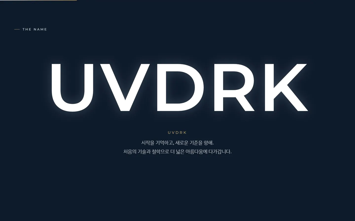
I read the name first

The first question I had was, ‘How can someone who sees these five unfamiliar letters read them for the first time?’

  1. UV

    The Heritage of Ultra V

    This means that we inherit the technology and experience that created the category called melting thread lifting.

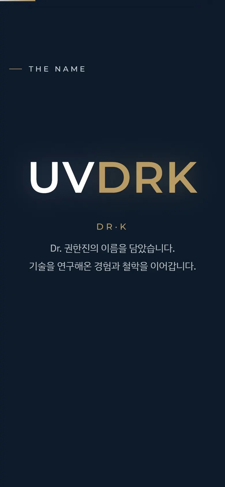
  2. DR·K

    Dr. Kwon Han-jin, and again

    It contains the meaning that the person who started Melting Thread Lifting is starting again under his own name.

  3. UVDRK

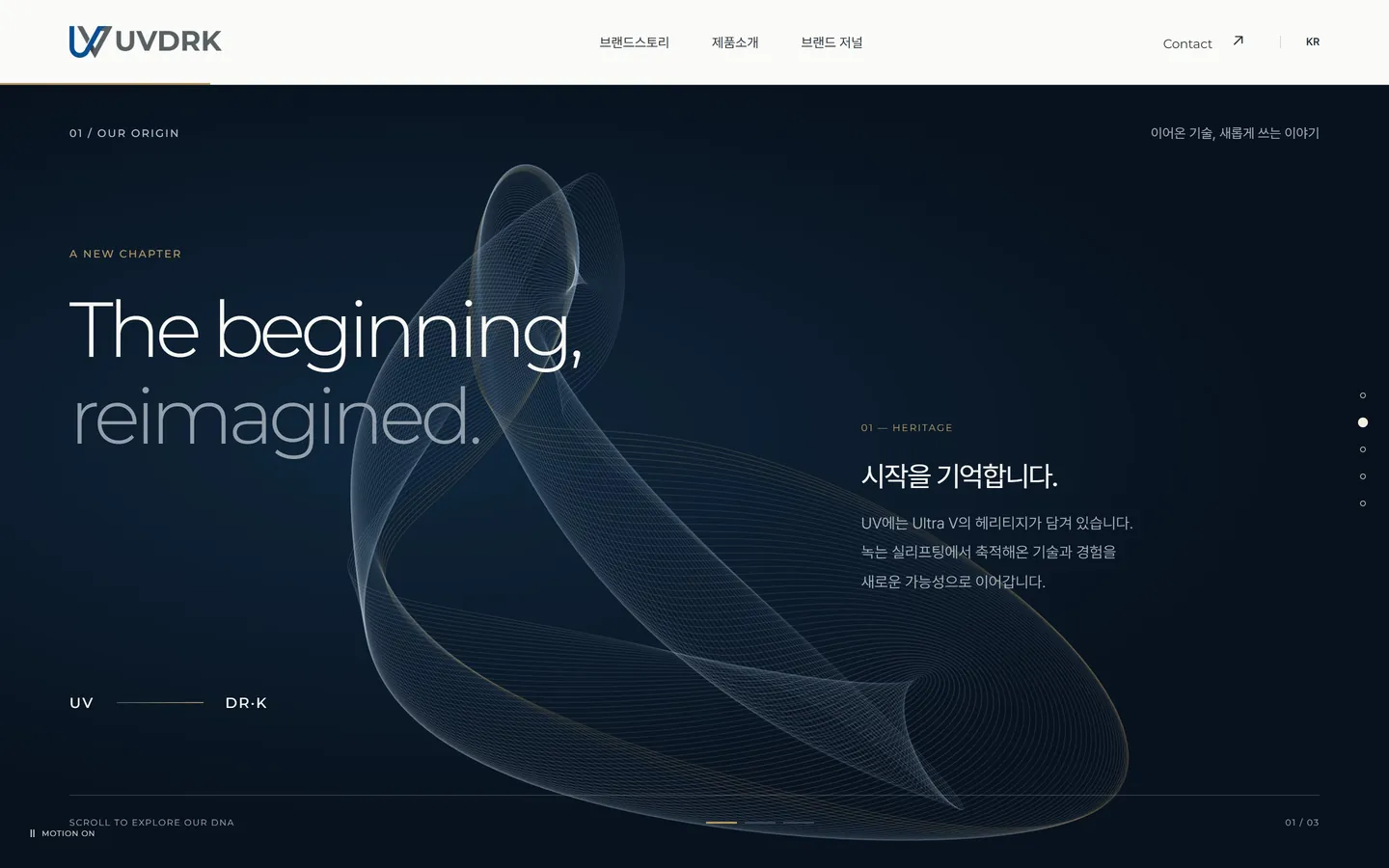
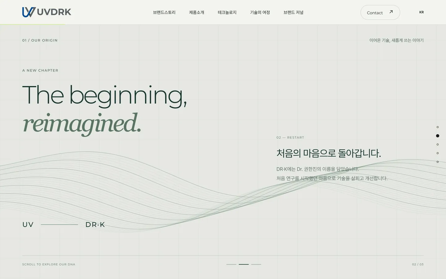
    The beginning, reimagined.

    Two names come together and become one beginning. All design decisions on this site start from this statement.

03 Motion Language

The brand story
through the life of a single thread.

The brand story in the plan was divided into five chapters, and the core values ​​were organized into succession, relaunch, and expansion. We have translated these sentences into the four states that a melting thread undergoes.

  1. 01TWIST · Succession

    Several strands are twisted into one thread.

    Ultra V's accumulated technology and experience are depicted in eight strands of light. The more the strands are twisted, the more they become one solid thread.

  2. 02DISSOLVE · Dissolvable thread

    The thread that has done its job melts and disappears.

    The essence of melting thread lifting has been transferred to movement. The disappearing scene was not the end, but the beginning of the next scene.

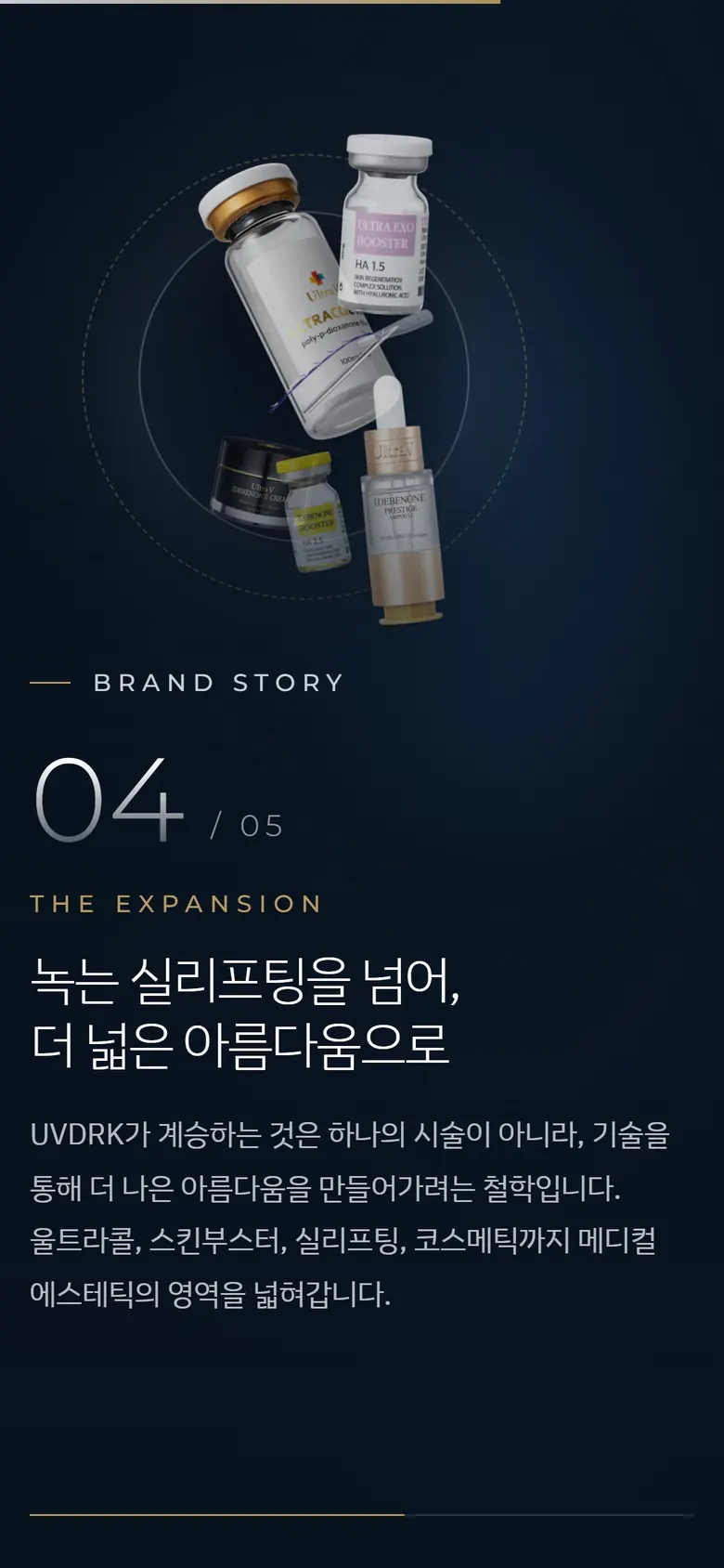
  3. 03EXPAND · Expansion

    Scattered particles spread over a wider area

    The product line, which expands from thread lifting to Ultracall, TRIDERM, skin booster, and cosmetics, is expressed as particles spreading out.

  4. 04RETURN · Back to the beginning

    The particles gather back into one circle

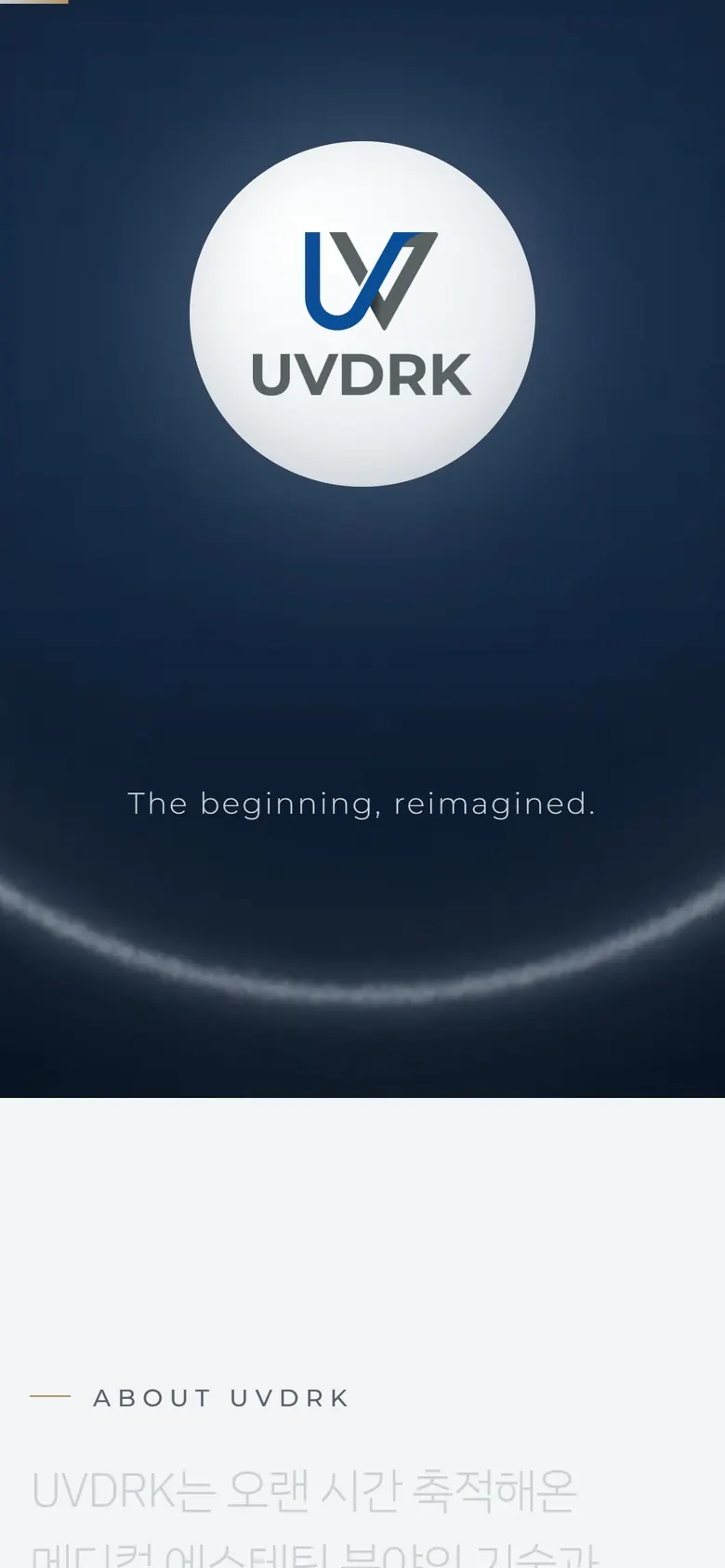
    A circle is both a starting point and a completed form. In design number 1, the logo appears inside this circle and the first scene ends.

This is a 168-frame motion graphic used on the main page of design number 1. Instead of letting the video play, each page is drawn according to the scroll position, so the visitor sets the pace of the story.

04 Color

When two documents state different
ratios

The draft brand guide we received suggested 70 white, 20 navy, and 10 gray, and the visual direction document used 60 navy, 27 white, 9 silver, and 4 gold as the standard. Instead of randomly choosing one side or the other, we screened both ratios and compared them.

It is light with wide margins and the information is easy to read. However, the first impression of the brand weakens and it becomes difficult to distinguish it from other hospitals or cosmetics brands.

It gives a deep and solid impression. Instead, long text and tables are difficult to read on the dark side, so you should set aside a light side.

The conclusion was to share scenes and information. Scenes that create an impression of the brand were placed on the navy side, and introductions and visions that require a long read were moved to the bright side to give them a breather.

  • logo only Logo Blue #004E97 RGB 0, 78, 151 This is the color of the provided logo. It does not change arbitrarily.
  • logo assistant Logo Gray #586164 RGB 88, 97, 100 The color used in the logo symbol and text is gray.
  • main Navy #0E1B2B RGB 14, 27, 43 This is the background color of the scene showing the brand.
  • background Deep Navy #08121E RGB 8, 18, 30 It is the deepest background on which motion and photography lie.
  • assistance Silver #C9CFD6 RGB 201, 207, 214 It is a secondary color that resembles metal and light.
  • text Charcoal #2B333D RGB 43, 51, 61 This is the text color of the text on the bright side.
  • point Warm Gold #B89A64 RGB 184, 154, 100 Write only one line and one dot.
  • information White #FFFFFF RGB 255, 255, 255 This is where information that needs to be read for a long time is placed.

I measured the logo file myself.

The standard value is #004E97, but the most used blue in the provided PNG was #094E96. We didn't recolor the files, we just put them on a checklist to check the final values ​​when exporting them for the web from the vector source.

DO

Gold is used only on one line under the title and on one point to emphasize.

DON’T

Repeating the gold border and box makes decoration appear more important than luxury.

05 Typography

The English text follows the texture of the logo, and the Korean text follows the ease of reading.

Montserratwght 200

  • UVDRKSemiBold 600 · Wordmark
  • MEDICAL DEVICEMedium 500 · Label
  • ULTRACOLLight 300 · Product Name

Again, with the same feelings as before

IBM Plex Sans KR Light · Visual direction recommended

Again, with the same feelings as before

Pretendard · Web Body

For visual direction, Montserrat was recommended for English and IBM Plex Sans KR for Korean, with Pretendard as an alternative. On the web, Pretendard, which has a wide range of Hangul thickness levels, is used in the main body, and in design number 2, a subset web font is created that selects only the letters used on the screen to reduce the size.

06 Layout

One strong image, one or two lines of short copy, and a blank space.

  1. 1Strong Image
  2. Short copy of 1–2lines
  3. 30–40%Leave blank

The layout formula for visual direction was created for social media posts. We reapplied this formula section by section of the web. Only one scene was placed on each screen, and changing scenes was left to scrolling.

Five things visual direction prohibits and our answers

  1. Repetition of gold borders and boxes

    Gold wrote only one line under the title and one point of emphasis.

  2. Fake medical device image

    All products, from Ultracol vials to TRIDERM equipment, are based on actual photos.

  3. Excessive 3D rendering, excessive use of skin close-ups

    The atmosphere was created using light, metal, glass, and curved materials. 3D was tested only on the shape of the yarn in design 2.

  4. List English words such as INNOVATION and PRECISION

    I chose to write one meaningful sentence out loud.

  5. EST. Made-up years like 198X
    I wrote only the confirmed history and divided it into personal experience and corporate history.

07 Material

light, metal, glass, curve

I first decided on the materials to use for photos and graphics. Instead of flashy decorations, we decided to create a feeling of luxury through differences in the way light hits and the materials.

Silver ribbon, glass disc, thin gold wire, translucent plate, silver beads and thin thread on navy paper
  1. It is a curved surface that resembles the precision of metal. This is where the silver tone of the buttons and dividers comes from.
  2. GlassThe transparent texture became the basis for the skin booster scene.
  3. Gold WireGold appears as a single thin line like this.
  4. Translucent boardLogos and text are placed on this calm surface, not on top of the photo.
  5. It is a memory of a thin threadmelting thread. The first scene of motion graphics starts from this line.

08 Exploration

Images drawn for one scene

We re-created the images for the main visual and scene transitions several times. Both what was adopted and what was eliminated served as the basis for the decision.

  1. silver filament images

    01Initial draft main

    silver filament

    Hundreds of silvery fibers form a single ring. This is the first image metaphorizing the heritage of thread lifting.

  2. thread of light image

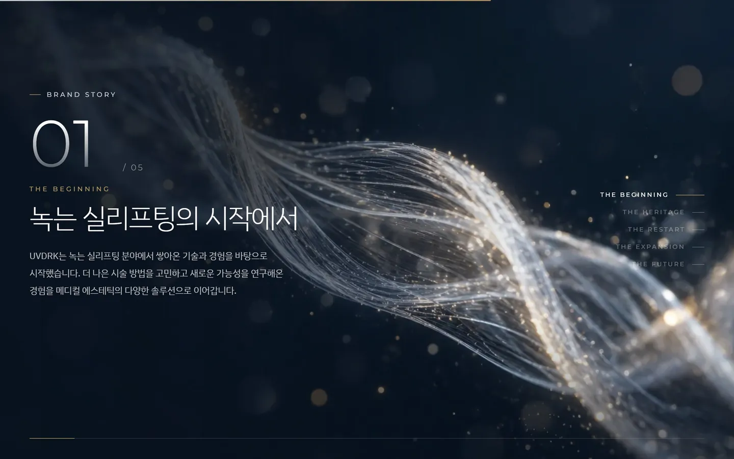
    02Design No. 1 adopted

    thread of light

    This is the background that supports the thread lifting section and the first chapter of the brand story.

  3. silver curve images

    03Design No. 1 adopted

    silver curve

    This is a bright transition scene that supports the brand introduction paragraph.

  4. dawn horizon image

    04Design No. 1 adopted

    horizon at dawn

    This is the dawn light used in the ‘And, here we go again’ scene.

  5. Device stage image

    05Design No. 1 adopted

    device stage

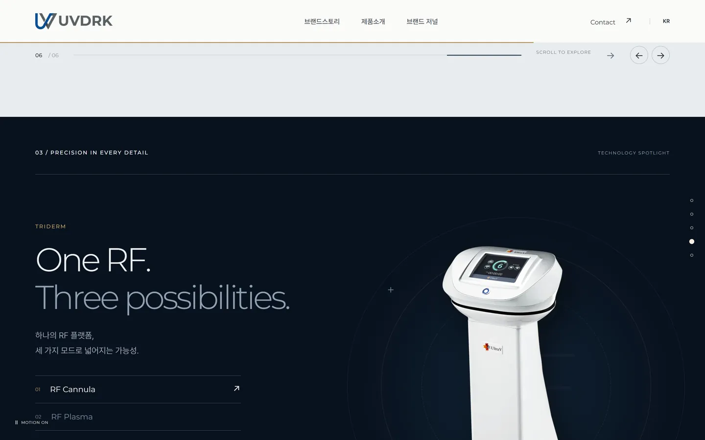
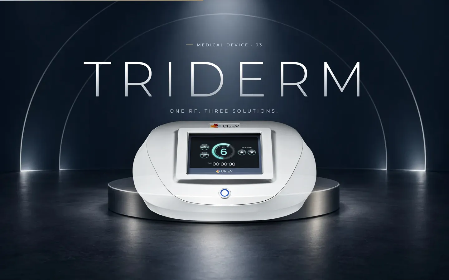
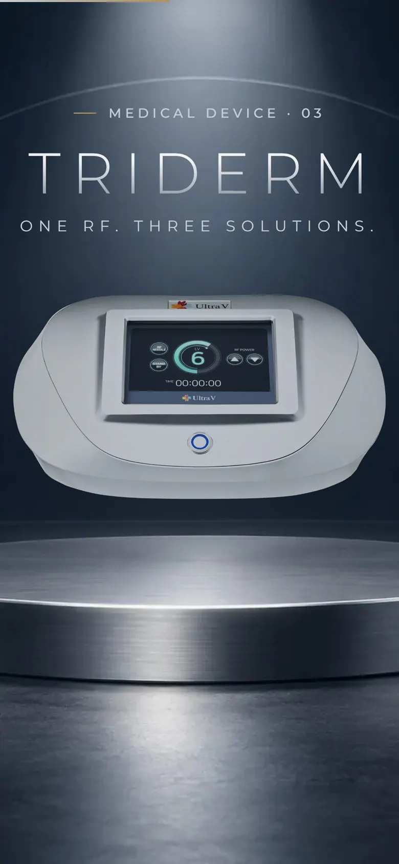
    This is the stage where TRIDERM stands. I posted actual photos of the equipment.

  6. booster glass images

    06Design No. 1 adopted

    booster glass

    This is the background for Skin Booster’s transparent texture.

  7. gold wave images

    07Design No. 1 adopted

    gold wave

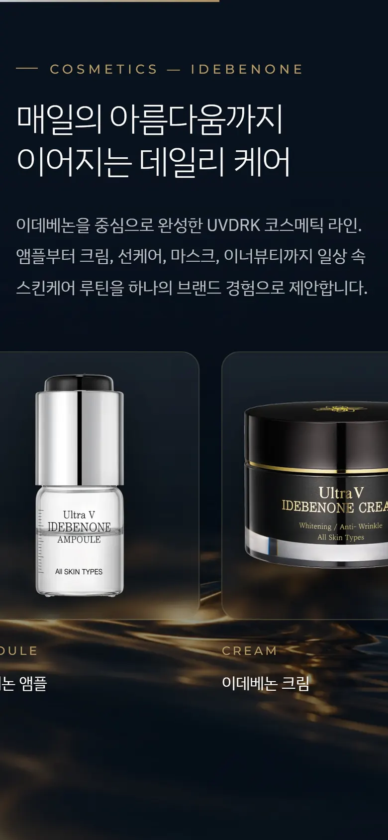
    This is the bottom light of the Idebenone cosmetic rail. Gold was left with only light.

  8. glass flower images

    08Replacement

    glass flower

    The details were so tight and sharp that I saw the picture before the product.

  9. glass ribbon images

    09Replacement

    glass ribbon

    This is a plan that replaces flowers with soft curves. We tested the green tone in design number 2 together.

  10. magnolia images

    10Excluding

    magnolia

    It was warm and beautiful, but far from the medical brand of understatement. After review, I changed it to a photo of the actual product.

09 Structure

Make the menu and main card say the same thing

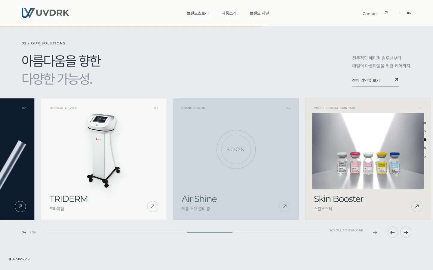
In the first plan I received, GNB's product menu and main product card were divided into different standards. To ensure that visitors can find the name they saw on the menu again on the main page, we first suggested meeting the two criteria when sending out a quote. Afterwards, with the addition of two types of equipment, six main cards and six product menus were organized in the same order.

UVDRK

  • Brand Story
    • Brand Story
    • Vision & Mission
    • Core Value
    • History
    • CEO
  • Product introduction
    • 1ULTRACOL
    • 2Thread Lifting
    • 3TRIDERM
    • 4Air Shine
    • 5Skin Booster
    • 6Cosmetics
  • News/Society
    • press release
    • Academic conference schedule
    • promotions
  • Contact
    • Distributor Inquiry
    • Skin Booster Inquiry
    • Request a Demo
    • B2B inquiry
    • Other inquiries
  • Recruit
    • Recruitment information
    • Recruitment Position

main card

  1. 1Ultra Call
  2. 2Thread lifting
  3. 3TRIDERM
  4. 4Air Shine
  5. 5Skin Booster
  6. 6Cosmetics

We searched for materials for 13 product lines.

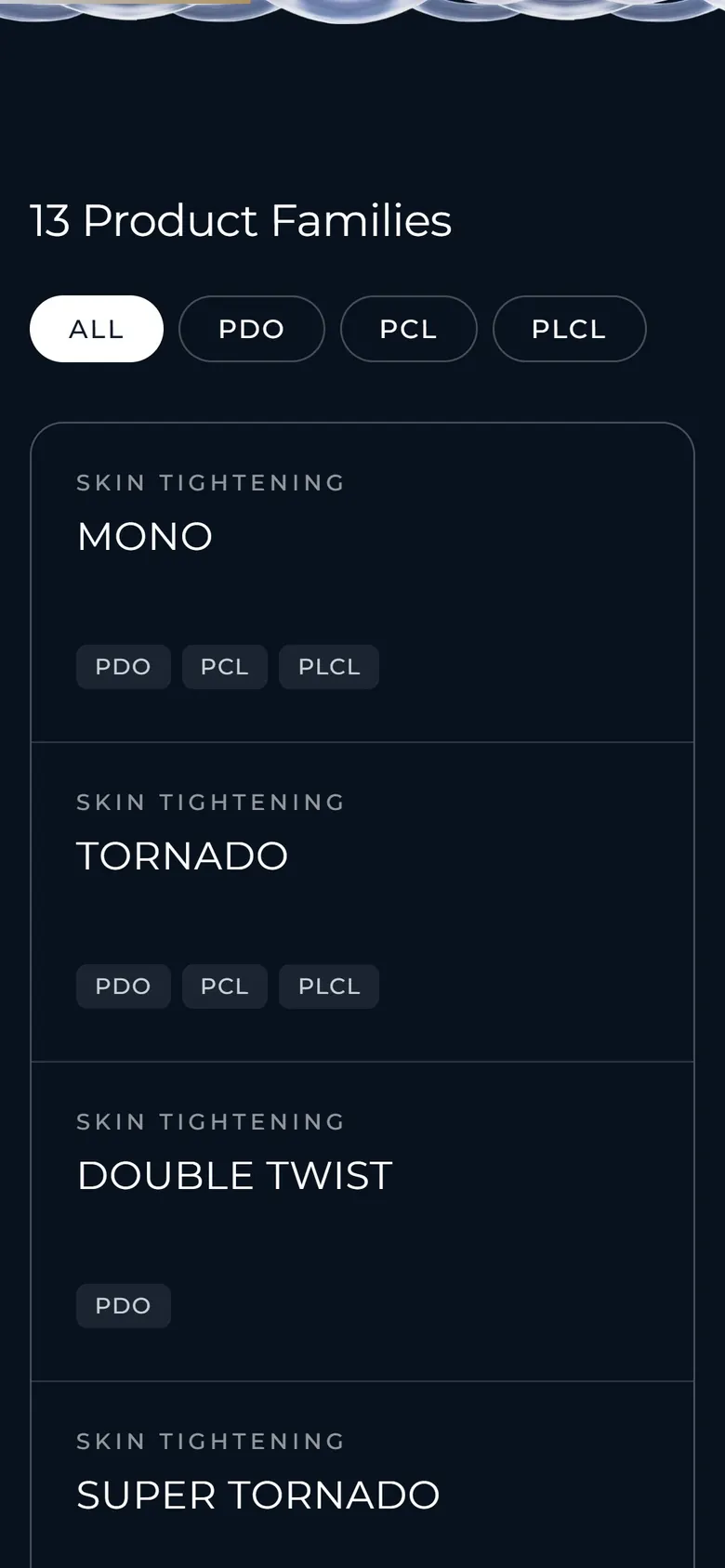
We compiled data on product lines and materials by comparing thread catalogs. For both designs 1 and 2, you can immediately find the product line you want using the material filter. Try pressing it yourself.

13 product lines

  • MONOPDO · PCL · PLCL
  • TORNADOPDO · PCL · PLCL
  • DOUBLE TWISTPDO
  • SUPER TORNADOPDO
  • INCHPDO
  • COGPDO · PCL · PLCL
  • MOLDING COGPDO
  • EMBOSS MOLDPDO
  • SUPER EMBOSS MOLDPDO · PCL
  • DOUBLE MOLDPDO · PCL
  • HIKOPDO · PCL
  • OCTO TWISTPDO · PCL
  • DOUBLE COGPDO

10 Design Drafts

Three design proposals,
three questions

The day after receiving the data, we created three directions with the same manuscript and the same product data. For each design proposal, we asked one question and found an answer.

Initial exploration plan

Silver FilamentWhat would it look like if you copied the guide as is?

This is the first draft that applies the colors and fonts of the visual direction. The main page opened with a silver filament image, the brand story was shown in a ring motion that rotated with a scroll, and the products were shown as a horizontally flowing collection. This structure later became the basis for the second design.

  • #08121E
  • #F2F1EC
  • #C9CFD6
  • #B89A64
  • Canvas Ring Motion
  • Horizontal Scroll Collection
  • TRIDERM Mode Tab
  • Save inquiry form
  • Initial navigation screen 1
  • Initial navigation screen 2
  • Initial navigation screen 3

Design number 1

Light ThreadCan the brand narrative be shown in one scroll?

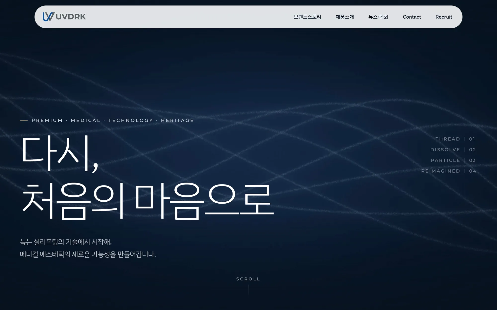
The main page was opened with 168-frame motion graphics, and the meaning of the name, six product lines, and five brand stories were laid out sequentially on one page. This plan is most faithful to the visual direction's ratio of navy, silver, and gold. The original logo was placed only on a white background.

  • #08121E
  • #0E1B2B
  • #C9CFD6
  • #B89A64
  • #FFFFFF
  • Scroll Play Motion Graphics
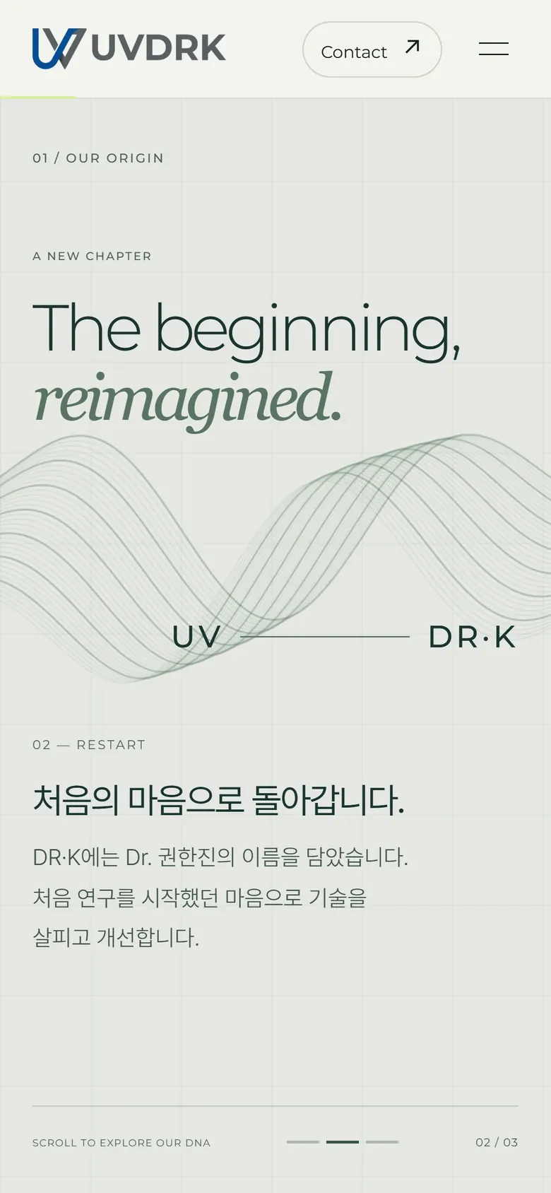
  • name interpretation scene
  • Filter 13 product lines
  • TRIDERM stage
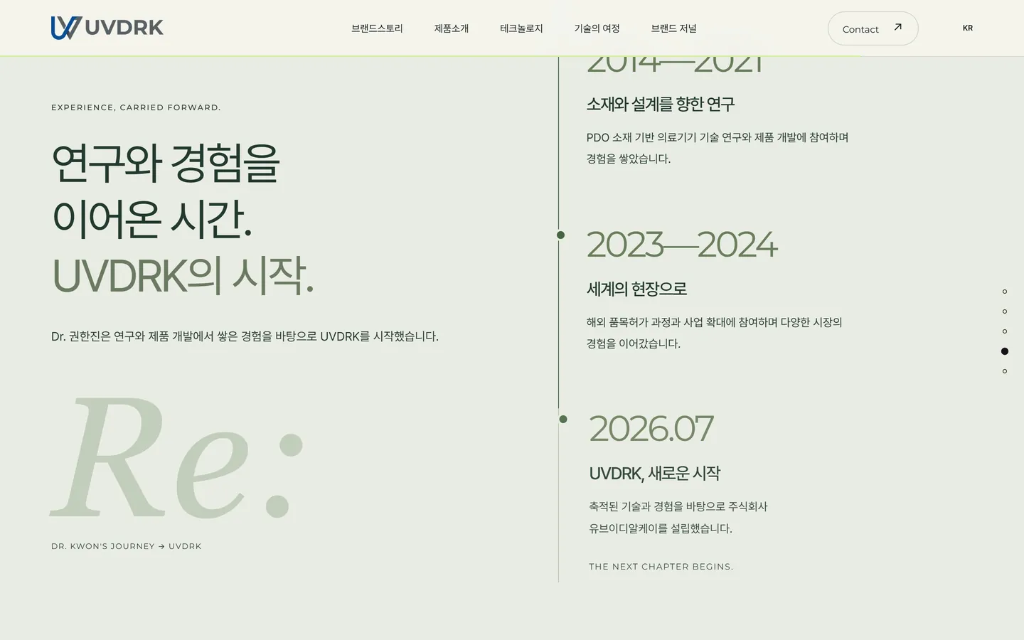
  • horizontal timeline
View proposal 1
  • Design proposal screen 1
  • Design proposal screen 2
  • Design proposal screen 3

Design number 2

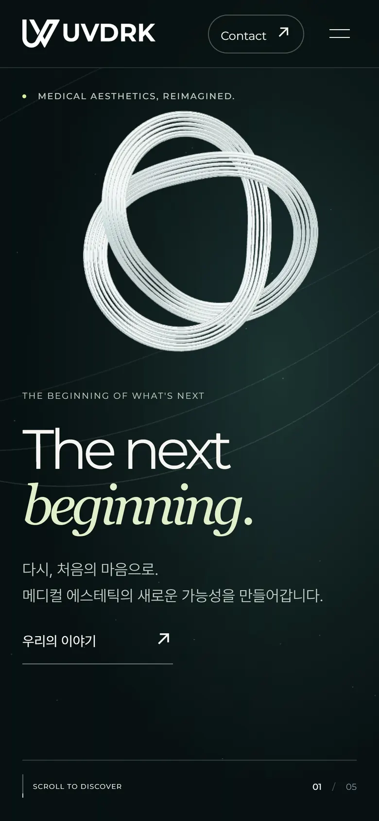
Next BeginningWhat will we see if we push the boundaries of the rules?

Chrome filament, drawn in real-time 3D, rotates and splits as you scroll. I changed the color to deep green and cream, and added six product films, an RF mode controller, and an editorial design history. Since we didn't go as close to the 3D that the guide warned about, 3D was only used for the shape of the yarn, not the product.

  • #10231E
  • #1B3A31
  • #EEF0E6
  • #D7F08A
  • #FFFFFF
  • WebGL Chrome Sculpting
  • 6 product films
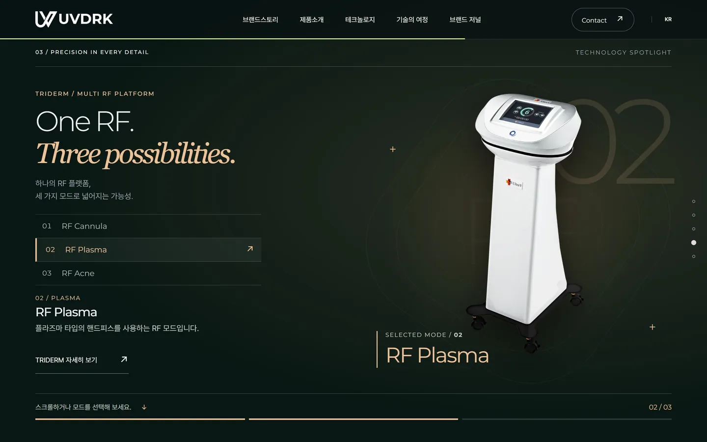
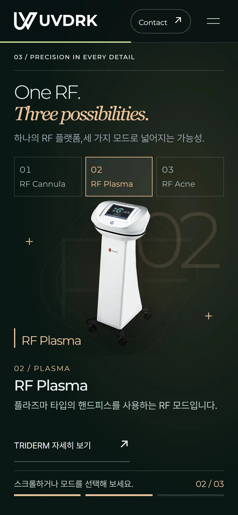
  • RF mode controller
  • Editable Layout
View proposal 2
  • Design proposal screen 1 2
  • Design proposal screen 2
  • Design proposal screen 3 2

Same sentence, different first impression

Move the handle left and right to compare the first screen of design 1 and design 2.

First screen of design proposal 2
First screen of design proposal 1

11 Details

Small scenes
create trust

  • Name interpretation

    The letters glow one after another to explain the meaning of UV and DR·K.

  • 13 product line screens

    13 product lines

    Use the material filter to instantly find PDO, PCL, and PLCL product lines.

  • TRIDERM stage screen

    TRIDERM Stage

    The equipment comes on stage and the three modes appear one after another.

  • RF mode controller screen

    RF mode controller

    I linked the click and scroll to point to the same mode.

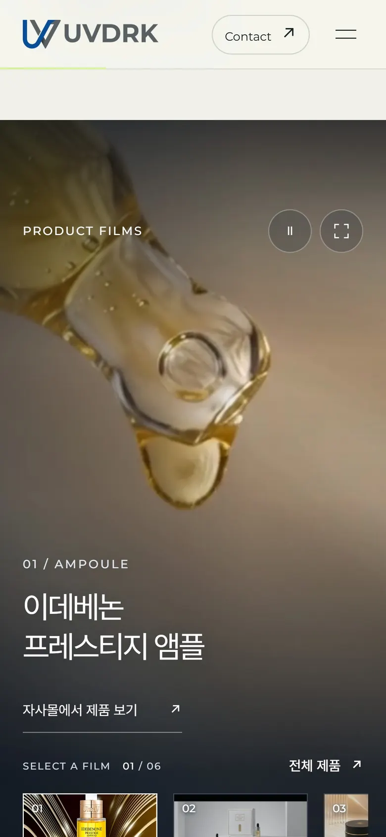
  • product film screen

    Product Film

    Only the selected video is downloaded, and playback stops when it goes off the screen.

  • Horizontal timeline screen

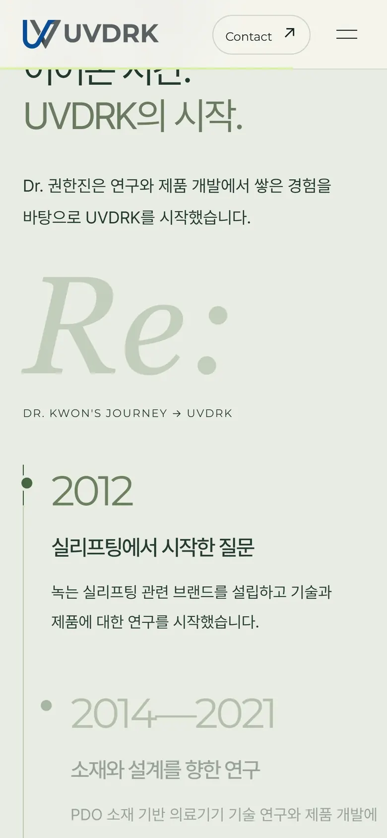
    Horizontal timeline

    It shows the individual's career history and the establishment of a corporation in 2026.

12 Devices

Same brand on any screen

I checked it myself for each major screen width, from 320px to 1440px. On low-height screens, the fixed presentation is released to allow natural flow, and visitors who have reduced motion turned on are shown the same content as a still screen.

The first screen of design proposal 1 displayed on the laptop screen
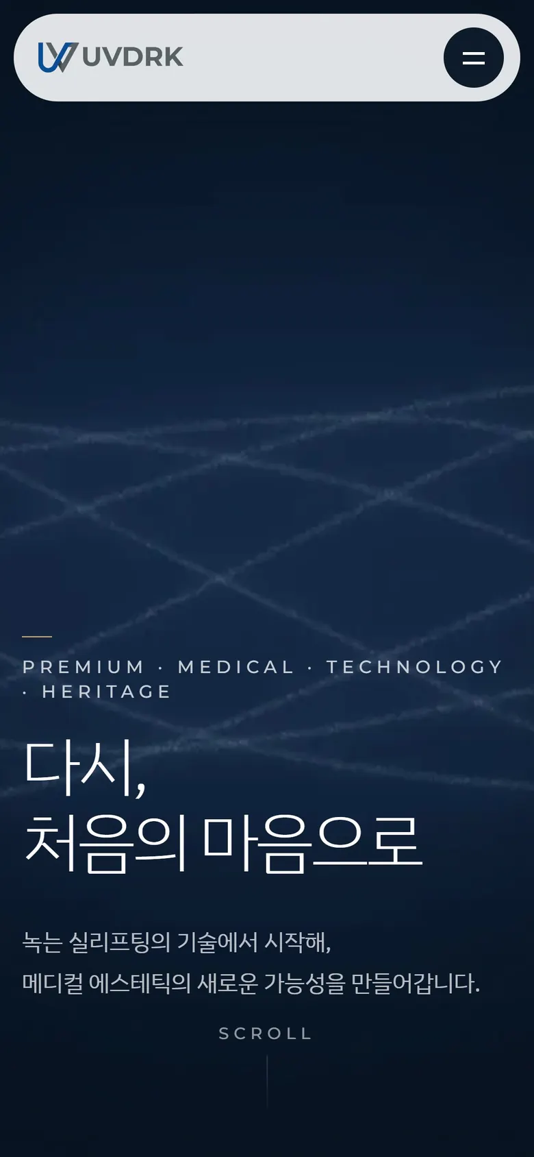
Mobile screen of design number 1 displayed on the mobile phone in hand
UVDRK poster attached to the light box in the hospital lobby
This is a scene where the same colors and sentences are translated into space signs.

13 Guardrails

Things we didn't do to protect our brand

It is as important for a medical aesthetics brand's website to be flawless as it is to look good. We adhered to the following principles from the design stage.

What hasn't been decided yet

  • Inverted logo file for use on a dark background
  • Check webfont license
  • Inquiry reception location and personal information consent statement
  • Detailed specifications for each thread lifting product line

In Design 2, we tested the dark header by changing the logo to white. Once you receive your approved inverted logo, replace it with that file.

  1. I did not use an unconfirmed product name.

    Product names scheduled to be changed will be used as they are now until they are confirmed. Once the name is decided, we created it so that only one place of data needs to be changed.

  2. Unconfirmed certifications are not displayed

    We decided to only use authentication phrases and badges that were currently confirmed to be valid, and removed items that had not yet been confirmed from the screen.

  3. It was not disclosed until the data arrived.

    Products with unconfirmed introduction materials were placed as ‘in preparation’ and no performance description was provided.

  4. We shared our personal careers and company history.

    The history is Dr. Kwon Han-jin's career and the establishment of UVDRK in July 2026 are described separately.

  5. I didn't make this post up

    For news and job postings, only spaces were created to be filled with actual text, and example cards showing the screen composition were marked as ‘example posts’.

  6. Product images are only actual shots.

    All products, from Ultracol vials to TRIDERM equipment and cosmetics, are photocopies of what was delivered.

  7. I didn't say much about its effectiveness.

    Skin boosters and cosmetics only introduce major ingredients and do not include expressions of efficacy or functionality.

14 Process

From inquiries to design proposals

  1. Initial inquiry and planning review

    We reviewed the plan and references and sent a schedule and estimate. A proposal to match the standards of the menu and main card was also included.

  2. Internal confirmation and data delivery

    We received 23 plans, original logo, draft brand guide, visual direction document, and 578 files of product materials.

  3. Data analysis and three design proposals

    We organized the differences between the two brand documents and the items that needed to be confirmed, and created an initial search plan and design proposals 1 and 2.

  4. Reflection of review opinions

    In design number 2, the lime green band was changed to navy and the magnolia image was replaced with an actual product photo. Six product films were gathered on one stage.

  5. Design confirmation and development

    Based on the finalized design proposal, we develop and open product detail pages and news, inquiry, and recruitment management functions.

The beginning, reimagined.

A brand's first homepage is the first document that shows what the brand stands for.

BlueCanvas reads manuscripts and materials first before drawing the screen. If you are preparing the first website of a new brand, we will start by organizing the materials you have now.

Contact

A rough idea is a good place to start.
Let’s shape your project together

Tell us where you are and what you want to achieve. We’ll outline a practical scope, process, and estimated budget.

4 questions · about 2 minutes

Scope

What would you like to work on together?

Select as many as apply. If you are not sure yet, choose “Other”.

Budget

What budget range do you have in mind?

Even a rough range helps us shape the proposal.

Project details

Tell us where you are right now.

It does not need to be polished. Tap an item below and the outline is filled in for you.

0

Upload up to 2 RFPs or reference files. Supported: PDF, PPT, Word, Excel, JPG, PNG, ZIP

Contact

Where should we reply?

Scope, budget, project details and contact information are required.